Written on April 30th, 2024 by Lucie Baratte. In case study.
Welcome to today's exploration of logo design, my name is Lucie Baratte, I am the creative director and founder of Logology, and I will share with you how I’ve designed a unique branding from a previously created symbol.
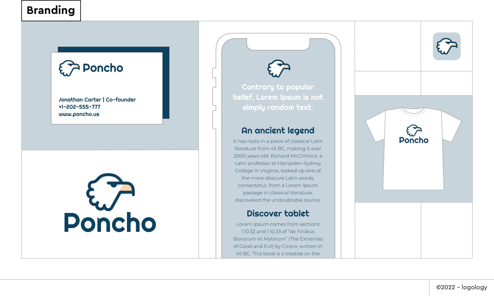
One of the advantages of Logology’s extensive catalog of designs is the ability to explore various concepts for a single company. Once you find your favorite, you can request customization of the selected logo to better suit the specific needs of your business branding. This tailored design process is available with our Establish package.
This is how John Brown and Jim Shelton, the founders of Poncho, approached us to create an original logo design for their startup.
I am glad to share with you the story of Poncho’s brand identity design, let’s begin!
1 – What is Poncho?
Conceived by two former Marines of the US military, Poncho is an app dedicated to military personnel, their spouses, and veterans. Poncho provides information and tools for budgeting, encompassing planning and organization. In addressing a significant area of concern for individuals, Poncho's mission is to bring reassurance, clarity, and efficiency to its users.
Before proceeding, John and Jim took the time to discover their startup's voice through our brand identity questionnaire. The emerging brand personality was described as 'kind with a classic tone,' coupled with the expected reliability inherent in any business offering financial services or information.
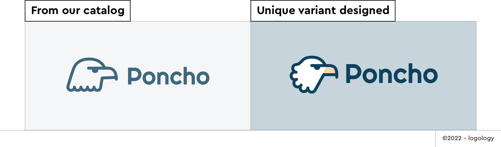
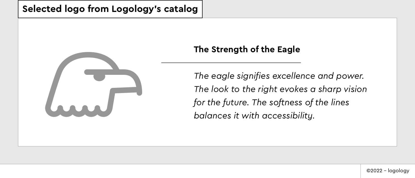
From the proposals presented by our platform, John and Jim were drawn to the eagle logo design.
Indeed, this logo concept offers several advantages for Poncho's branding:
- The eagle symbolizes excellence and trustworthiness, with the bald eagle being a prominent symbol of the USA, featured on many official documents.
- Utilizing a mascot effectively personifies the company, fostering a friendly bond with the audience and injecting a welcome sense of lightness and reassurance into serious topics. Additionally, a mascot evokes a sense of team spirit, which is particularly relevant in the military sector.
However, in its current state, the reference to the bald eagle of the USA wasn't sufficiently clear.
This prompted John and Jim to go with the Establish package and reach out to me.
2 – Challenge
As we explored Poncho’s values and the significance of the American eagle in pop culture, it became evident how humor about military symbolism, like the eagle, fosters a sense of belonging and community among military personnel. This connection resonated deeply with the name chosen for the app by John and Jim – 'Poncho,' a symbol of familiarity and reassurance, akin to the essential tool soldiers keep for rainy days.
With a clear understanding of Poncho's brand personality, its audience, and the symbolism of the bald eagle, I found myself confronted with a significant design challenge.
- How could I balance seriousness with playfulness while maintaining reliability and confidence?
- How could I convey warmth and welcome with a strong, focused tone without losing approachability?
- And most importantly, how could a mascot enhance the appeal of a financial tech business and unite its audience?
I had a few ideas in mind, but at this point, the best way to gauge their potential was to dive into sketching, and then sketch some more…
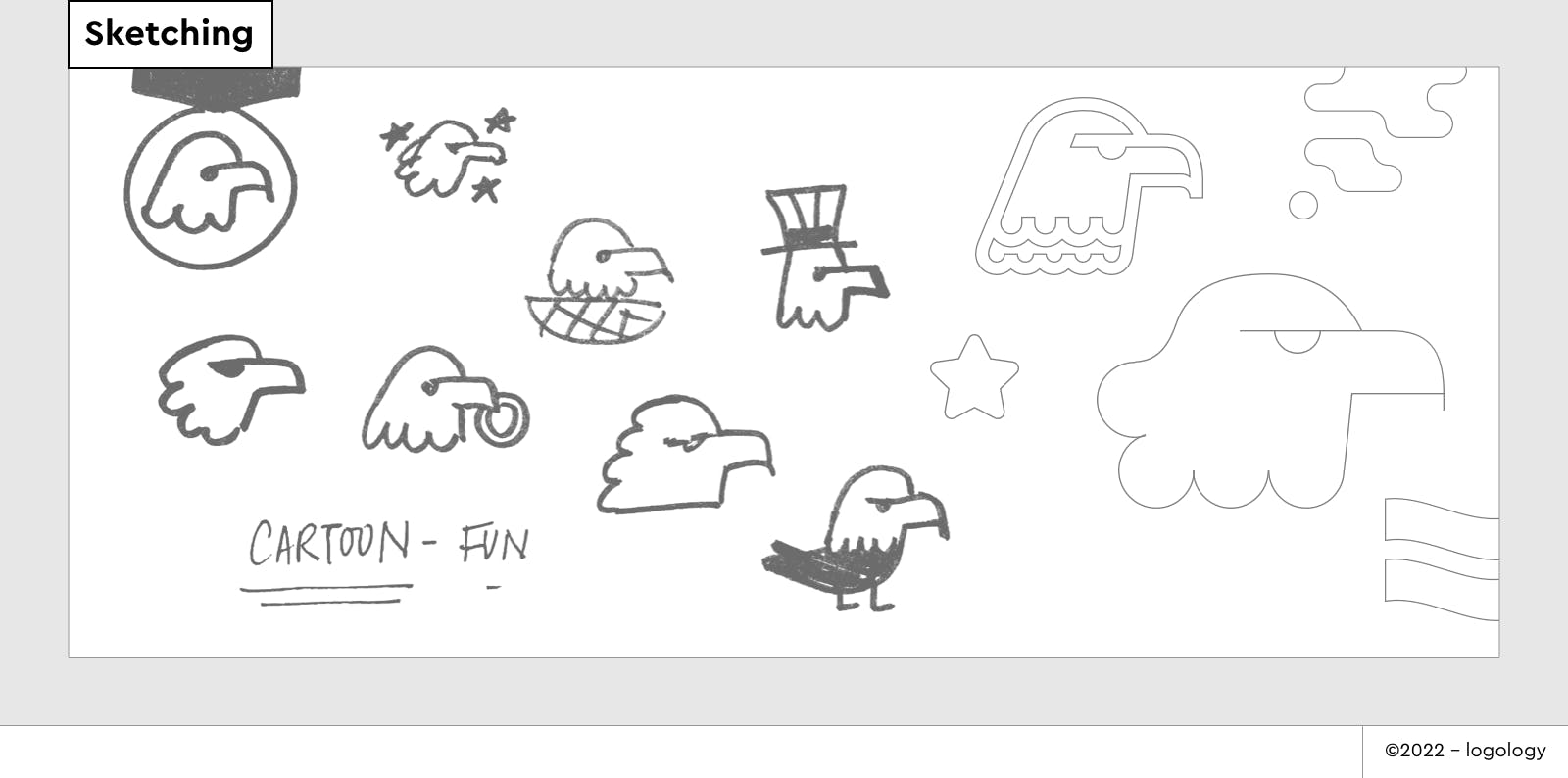
3 – Design Ideas
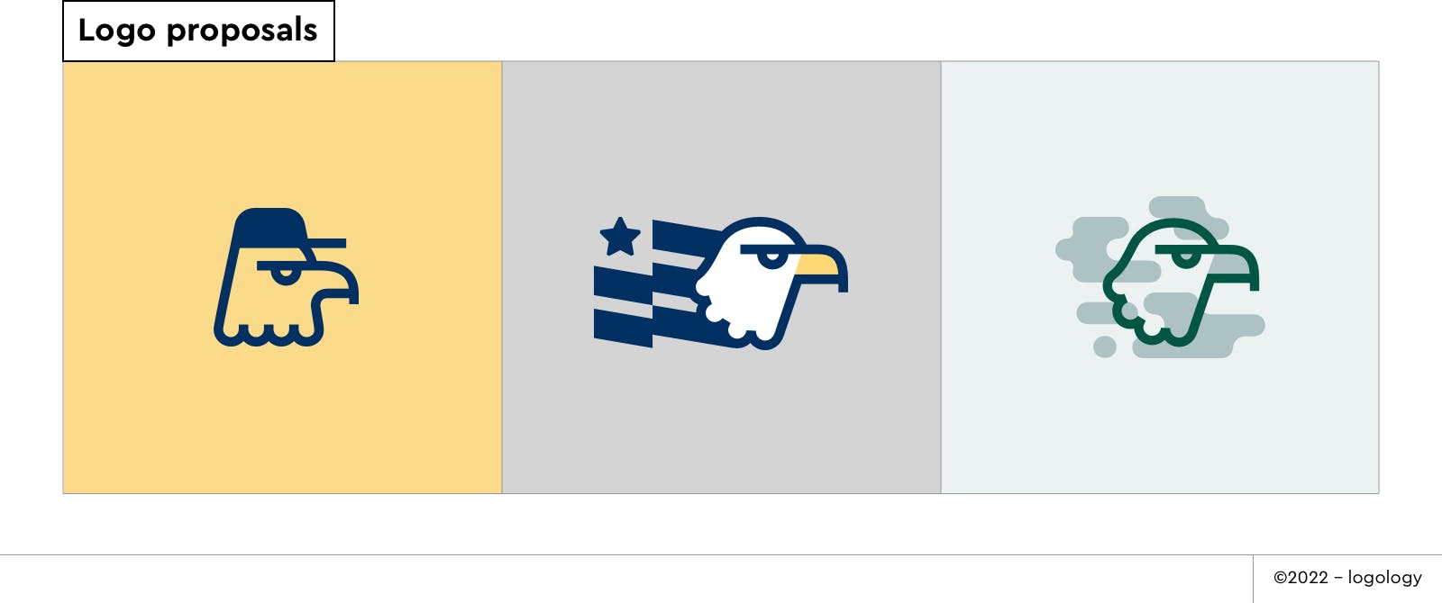
I explored a few variations of the initial concept:
- Bald Eagle Wearing a Cap:
The bird's head is now upright, conveying strength and seriousness. The addition of the cap suggests authority and command. This eagle embodies a playful yet decisive and trustworthy character. - Star Spangled Bald Eagle:
The iconic bald eagle is associated with a star and stripes, referring to the USA's flag. It embodies the spirit of a leader: reflecting resilience, dedication, and a commitment to service. - Bald Eagle In Camouflage:
This logo combines the iconic bald eagle with military-inspired camouflage, symbolizing strength and adaptability. With a fun tone, it evokes a sense of strategic thinking and resilience, reflecting the brand's alignment with military values.
4 – The final brand identity
After hours of research, and another meeting with John and Jim, I was confident we had found the solution!
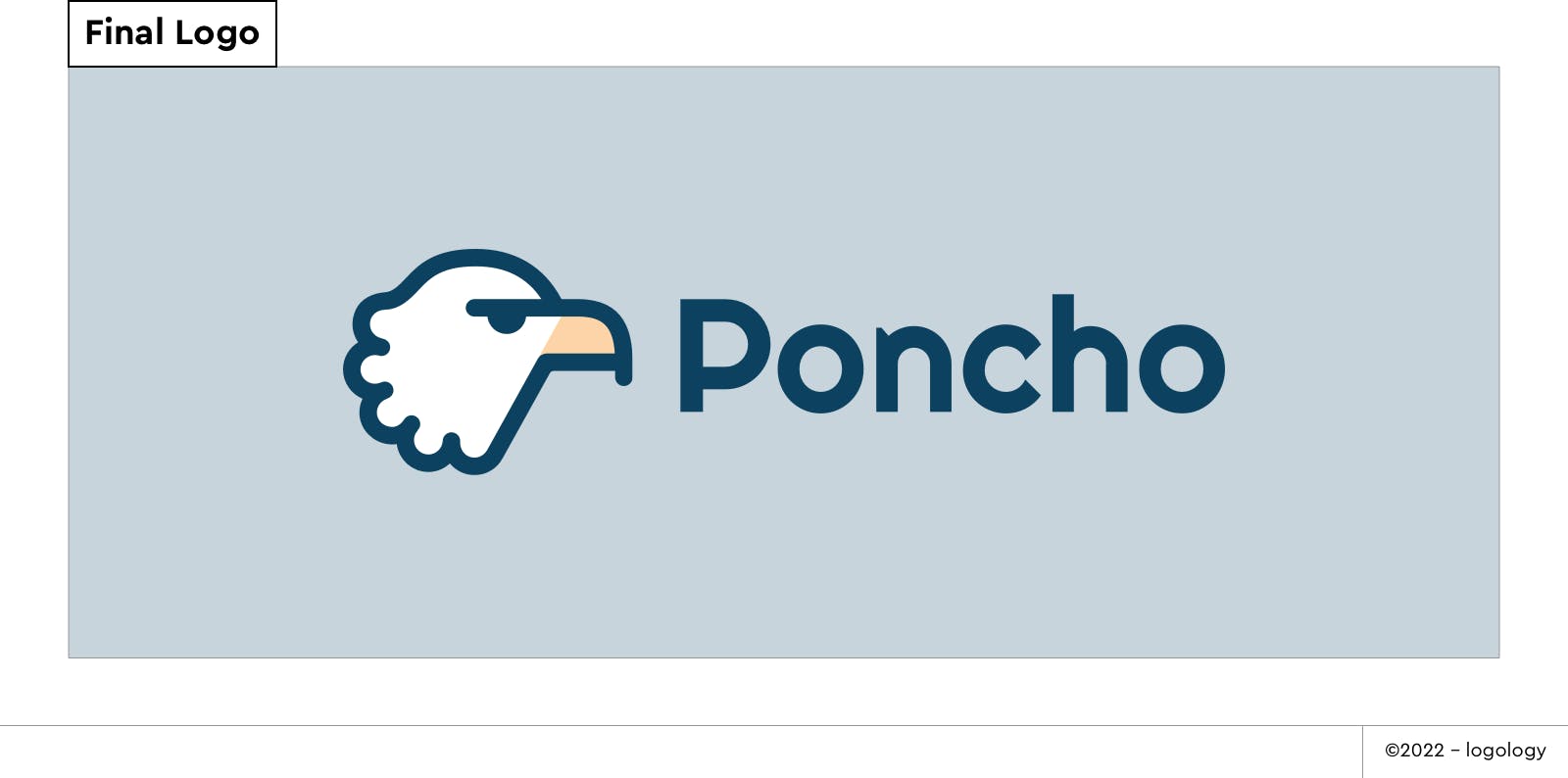
Concept & icon meaning
“The Confident Bald Eagle”.
The bald eagle, a revered symbol of excellence and power, holds profound cultural significance. Revered by Native Americans as a spiritual messenger and reminiscent of the ancient might of the Roman Empire, it was adopted as the emblem of the American nation in 1782. With its gaze directed towards the right, symbolizing foresight and vision, the eagle exudes determination and clarity. Balanced by soft and rounded lines that convey approachability, the logo strikes a harmonious blend of seriousness and warmth. Its serious, focused expression is complemented by a playful and simple design, embodying a character that is both dynamic and trustworthy.
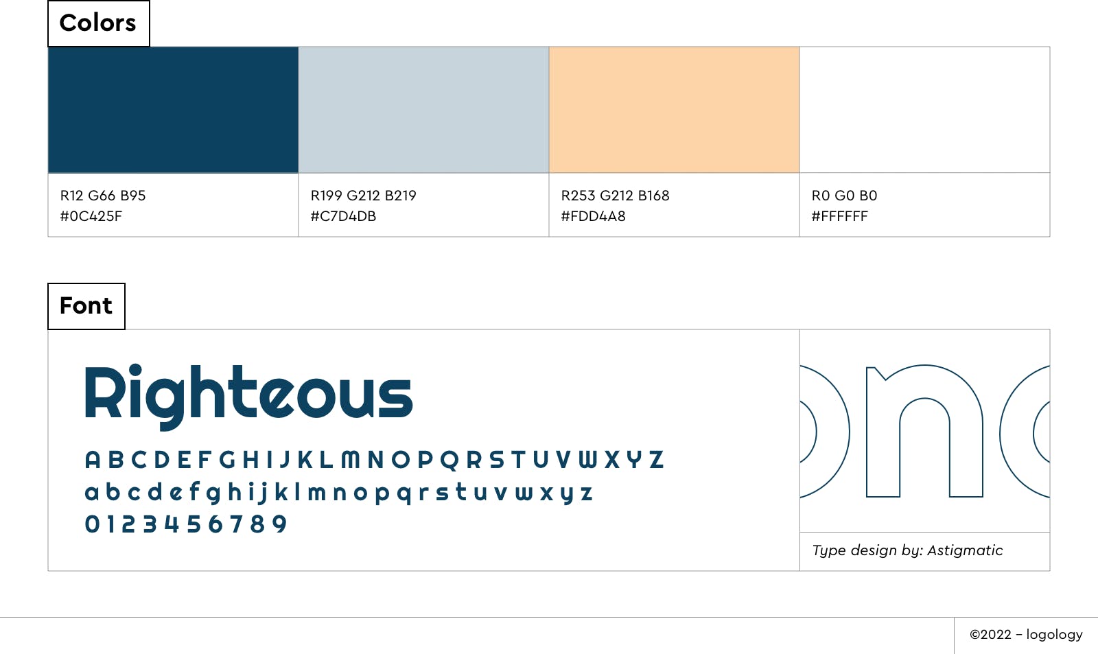
Colors meaning
- The deep blue tone, reminiscent of the navy blue entrenched in US military culture, is complemented by a hint of green, balancing strength and trustworthiness with wellness and innovation.
- The blue-grey evokes stability and elegance, with a cool and calm demeanor.
- The soft orange tone, chosen to enhance the legibility of the bald eagle, adds a dynamic energy, radiating warmth and fun.
Font meaning
The font Righteous by Astigmatic embodies efficiency and clarity with its sans-serif design. Its bold weight gives the brand a sense of stature and presence. The font's distinctive letterforms, featuring a slanted axis, bring originality and dynamism. The roundness of the letterforms adds warmth and comfort to the brand's identity.
5 - Closing thoughts
I'm truly thankful for the opportunity to collaborate with such wonderful individuals like John Brown and Jim Shelton. Their kindness and intelligence make them exceptional entrepreneurs, and their commitment to supporting their former professional community deeply resonated with me. I infused these emotions into my design for Poncho, hoping to contribute to its growth.
Your financial well-being, and that of your family, deserve reliable support. If you're a member of the US military, a veteran, or a family member, consider exploring Poncho today!
If you're a project leader seeking a standout visual identity for your business, Logology offers a range of logo designs tailored to various startup needs. Whether you find one you love or need customization, like I did for Poncho, I'm here to help.
If you have any questions or suggestions, feel free to reach out. I'd also appreciate your thoughts on this article—share them with me on Twitter. I'd love to hear from you and receive your feedback!
❤️
Lucie Baratte
happy art director & founder of Logology