Written on March 24th, 2022 by Lucie Baratte. In case study.
My name is Lucie Baratte and I am the creative director and co-founder of Logology. I am the designer behind every logo, so far, on the platform. Today, I will share with you the process of creating a custom brand design.
The founder of Wide Angle Analytics, Jaroslaw Rozanski, asked us to create a unique brand design for his new startup.
The originality of his company lies in its humanistic positioning: ethical and respectful of everyone's privacy. It’s not merely an expert analytics tool. But it shares all its qualities. Here is the communication challenge: how can the logo allow to be identified as a reliable startup, providing a practical and safe tool, while simultaneously asserting its benevolence and specificity?
This is the story of Wide Angle Analytics’ brand identity design.
1 – The values of the company
First, let’s have a look at the background.
Jaroslaw has been a developer and software engineer for years. He knows the field very well and wants to turn his expertise into a product that inspires others.
Wide Angle Analytics is a data analysis tool. It provides a large range of features and advanced possibilities for marketing experts. When it comes to data analysis, customers ask for efficiency, security, and simplicity. Tools have to be easy to understand and manage.
But Wide Angle offers more than just a safe and reliable service. In a world where privacy on the internet has become a sensitive issue, it stands out by adding a conscious perspective. It provides full control and responsibility of the data to the website owner.
Therefore, Wide Angle Analytics’s values mix accuracy and kindness, simplicity and originality, solidity and freshness.
Before we started, Jaroslaw took some time to discover the voice of his startup thanks to our brand identity questionnaire. Then, he picked up a few logos from our catalog. This stage helped us define the message and values of Wide Angle Analytics, and to perceive the aesthetic taste of its founder.
2 – Reviewing the ecosystem
After I had a better understanding of Wide Angle's values, the first thing to do, before rushing to the sketchbook, is get to know the ecosystem in which our brand will live. What are the main competitors of the sector? What kind of values do the competitors convey with their branding? What do their logos look like?
Here are 3 main competitors to observe.
1/ Google Analytics
The most famous of all.
The logo's meaning:
The symbol is an ascending bar graph. It evokes data growth. The rounded shapes add a sense of warmth and softness. The colors of the icon, orange and yellow, bring energy and dynamism.
The font is a geometric sans serif tainted in soft grey. It shows efficiency and smartness. The grey hue, on a white background, gives a sense of simplicity.
The message wanted:
Through all these clues, we can see that the main values Google Analytics wants to express are simplicity, dynamism, and reliability. These values emphasize the perception of Google Analytics as a tool, efficient and easy to handle.
2/ Simple Analytics
The modern challenger.
The logo's meaning:
Just like Google Analytics, Simple Analytics chose an ascending bar graph as a symbol to evoke data growth. But here, unlike its famous competitor, the bars are thin and straight. This design conveys more simplicity and clarity. The color of the icon, a soft red, indicates energy and boldness with a sense of warmth.
The font is a geometric monospaced sans serif tainted in dark grey. It shows efficiency and smartness more originally. Indeed, the monospaced font refers to the computers’ world, it suggests that Simple Analytics wants to be perceived as a modern brand for developers, a brand that has a vivid understanding of the internet game. The dark grey gives stature to the brand. The soft blue background balances it with calm and seriousness.
The message wanted:
By appropriating visual components similar to Google Analytic's brand (the bar graph, the warm color, the grey font), the startup Simple Analytics demonstrates through its branding that its ambition is to be a challenger to the giant. In addition to the seriousness and stability of the tool, the values highlighted here are modernity, clarity, and simplicity. Indeed, the baseline of the company is very clear about its identity: “The privacy-first Google Analytics alternative.”
3/ Matomo
The kind challenger.
The logo's meaning:
The choice of an initial, M, rather than a figurative symbol, lends authority and strength to the brand. The design is rounded and colorful. The hues are intense but not vivid, they keep softness alive and represent warmth and energy. The roundedness of the shapes, bringing comfort and welcome, is balanced by the diagonal lines of force. Therefore, the logo evokes both stability and dynamism in an original, cozy way.
The sans serif font emphasizes the symbolism of the initial. Its rounded edges and geometric structure refer to warmth, welcome, protection, kindness, and simplicity. The dark grey hue allows it to stay strong and serious enough.
The message wanted:
The brand design of Matomo is a very different statement than the ones of Google Analytics and Simple Analytics. Indeed, through colors and shapes, Matomo appears as gentle, friendly, and yet a solid alternative. Let’s note that their baseline is essentially the same as Simple Analytics: “Google Analytics alternative that protects your data and your customers' privacy.” The protection value has the last word here.
3 – Challenge
Now that I have considered the values of Wide Angle Analytics, its audience, and the messages displayed in the sector, here’s the design challenge I face:
- How to express kindness and protection while keeping the reliability and solidity alive?
- How to stand out of the crowd and still be identified and trustworthy in the web analytics sector?
- How to display pragmatism and security without being boring?
I already had a few ideas but, at this stage, the only way to find out if they were good ones was to sketch, sketch and sketch again…
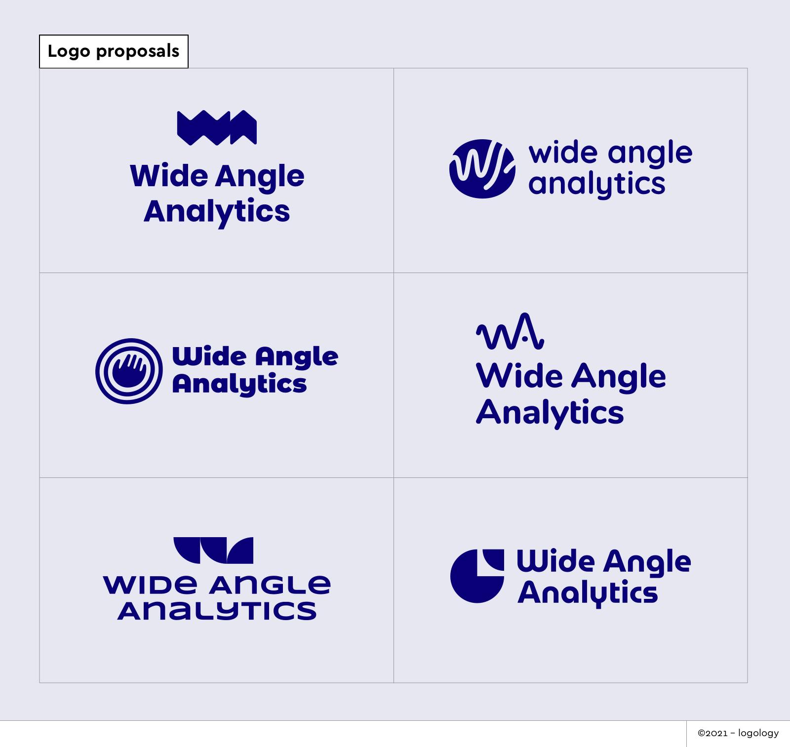
4 – Design Ideas
When designing a logo, it is essential to create a visual echo of the company name. Not an explanation, as it would be an offense to the audience's intelligence, but rather a suggestion.
The name “Wide Angle Analytics” contains the idea of taking large perspectives on a topic, being different, being new, knowing more, understanding more…
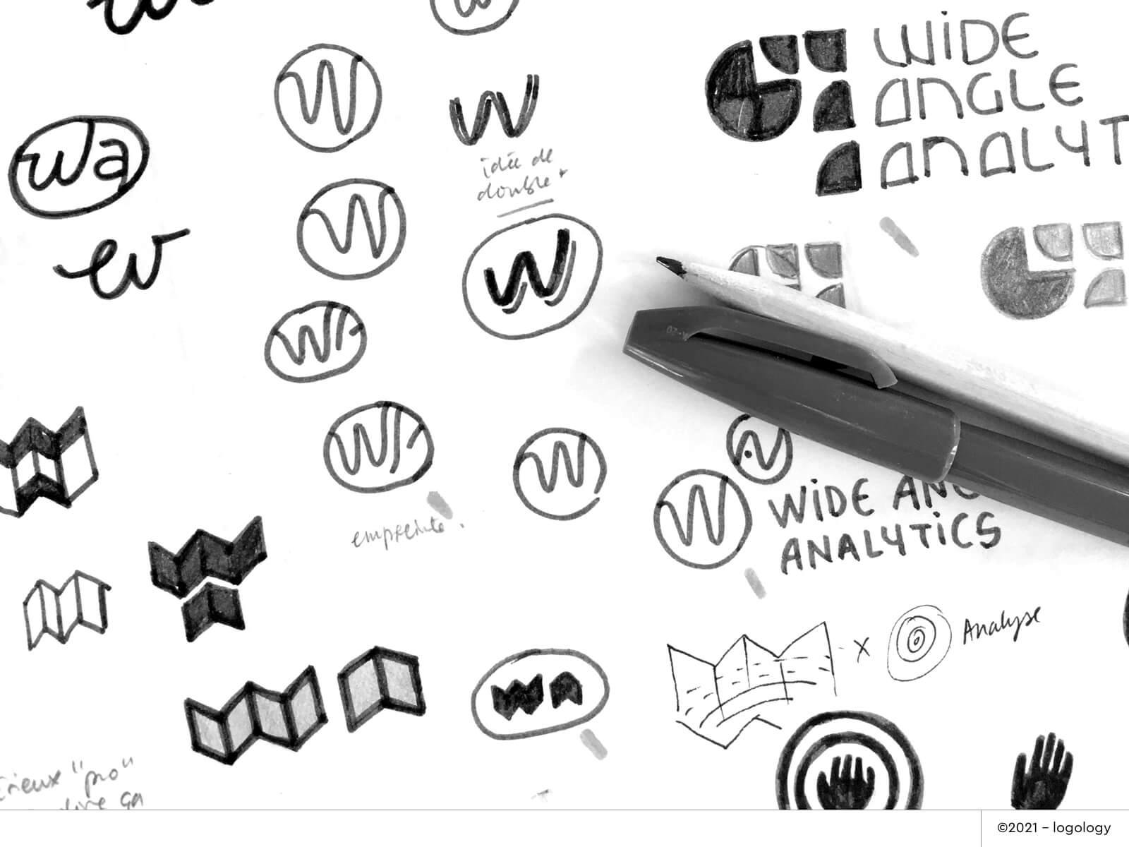
I explored many concepts for the logo:
- Opened map: The unfolding map symbolizes the many possibilities of exploration. It refers to the vast world of data. The monogram adds a sense of authority and reliability. It conveys the idea of guidance.
- Engraved Pebble: Pebbles symbolize at the same time solidity, stability, and softness, roundness. An engraved one refers to ancient cultures' symbolism, it conveys the idea of a tribe, and therefore community and respect. The monogram adds a sense of reliability and simplicity.
- Hand, imprint & circles: Hands symbolize control, imprint, and protection. The circles suggest an echo and expansion effect. They also convey protection and softness. The hand and the circles emphasize the notion of responsibility.
- Charts: The charts symbolize a clear vision of the data, exploration, and growth. They convey movement and expertise. The monogram adds a sense of authority and trustworthiness.
- Pie chart: The pie chart symbolizes data. The circle conveys wholeness, protection, and reassurance. The up-right pointed arrow brings a connotation of dynamism, sharpness, and growth.
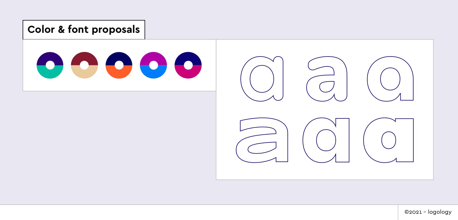
Colors
I had two concerns for the colors: preserve the reliability with a cold or dark hue but, in any case, find a soft and warm tone to enlighten it.
Here are some examples of color combinations for Wide Angle Analytics:
- Navy blue + soft turquoise
- Warm brown + light ochre
- Dark blue + vivid orange
- Electric blue + purple
Fonts
I stay with a sans-serif font to convey efficiency and modernity. Then, I tried different variations:
- Geometric shapes evoke simplicity and smartness.
- Rounded forms signify welcome, warmth, and kindness.
- Thin weight to bring lightness or bold weight to add stature to the brand.
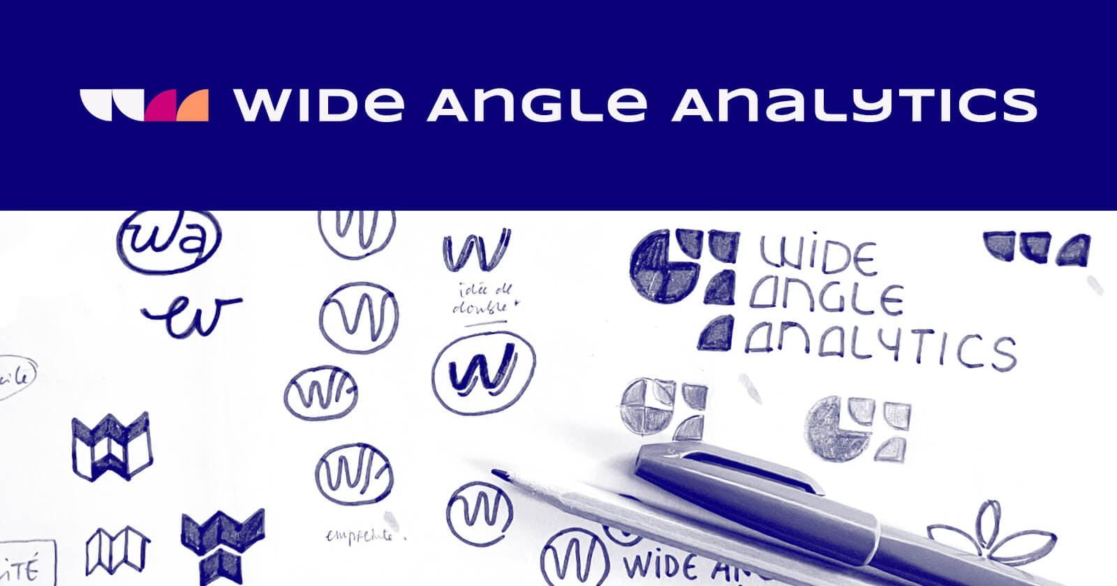
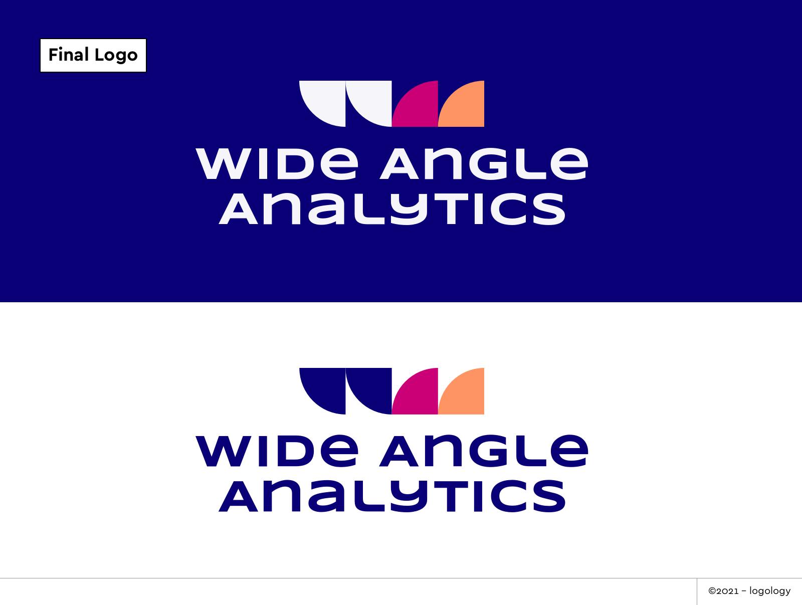
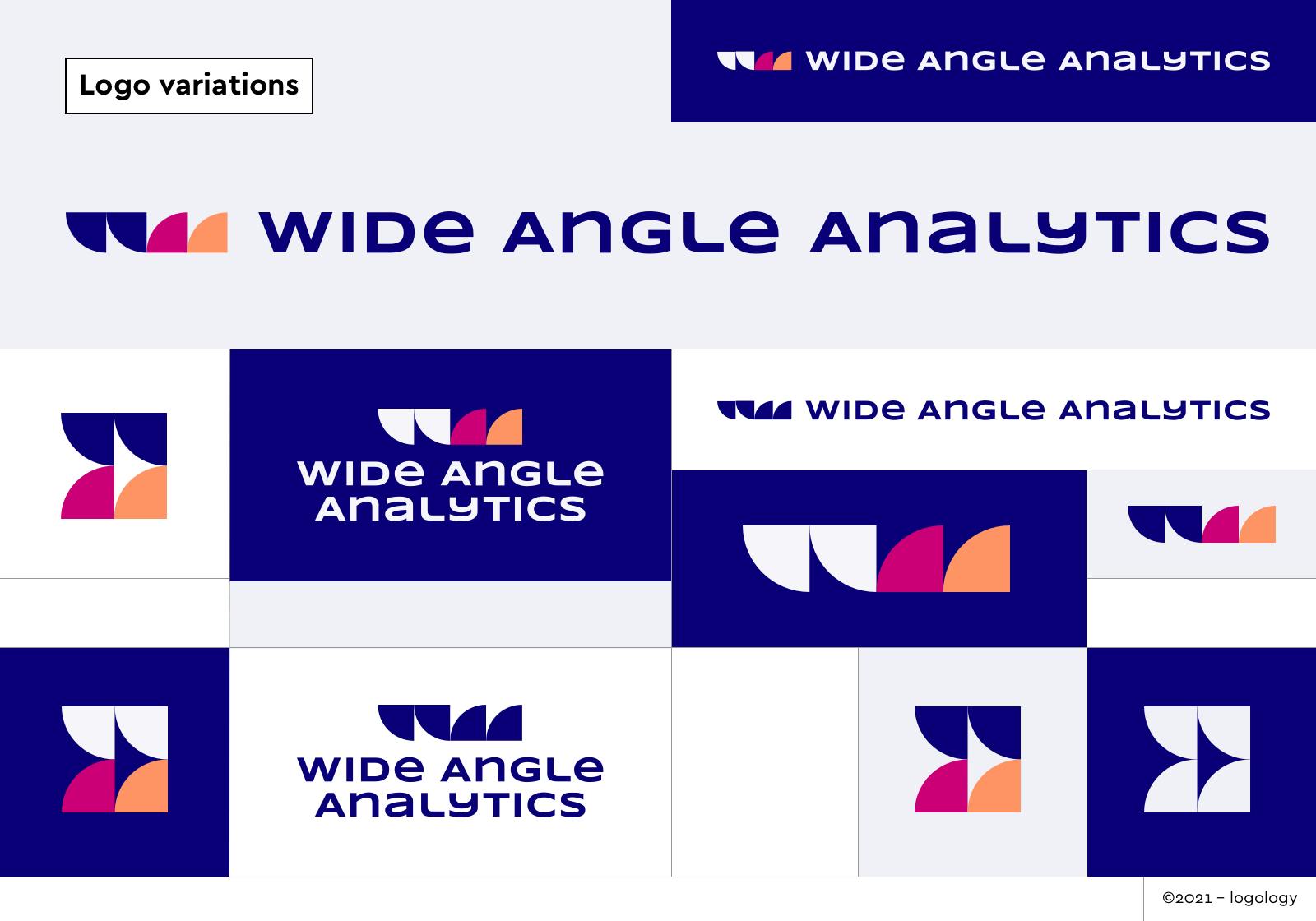
5 – The final brand identity
After hours of research andafew meetingswith Jaroslaw, I knew we got the good one!

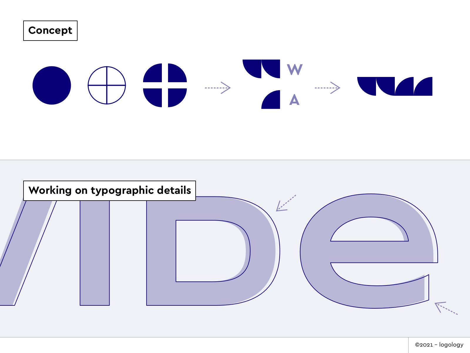
Concept & icon meaning
“Piece By Piece”
The circle symbolizes the infinite range of data. It conveys protection and kindness. Each slice of the circle is put apart to get a clearer, stable vision. Two slices shape a W, one slice form an A. So, from a full circle, you can read all the initials of Wide Angle Analytics. The concept of the monogram adds a sense of authority and reliability. It is a great way to combine reassurance with a more unusual mood.
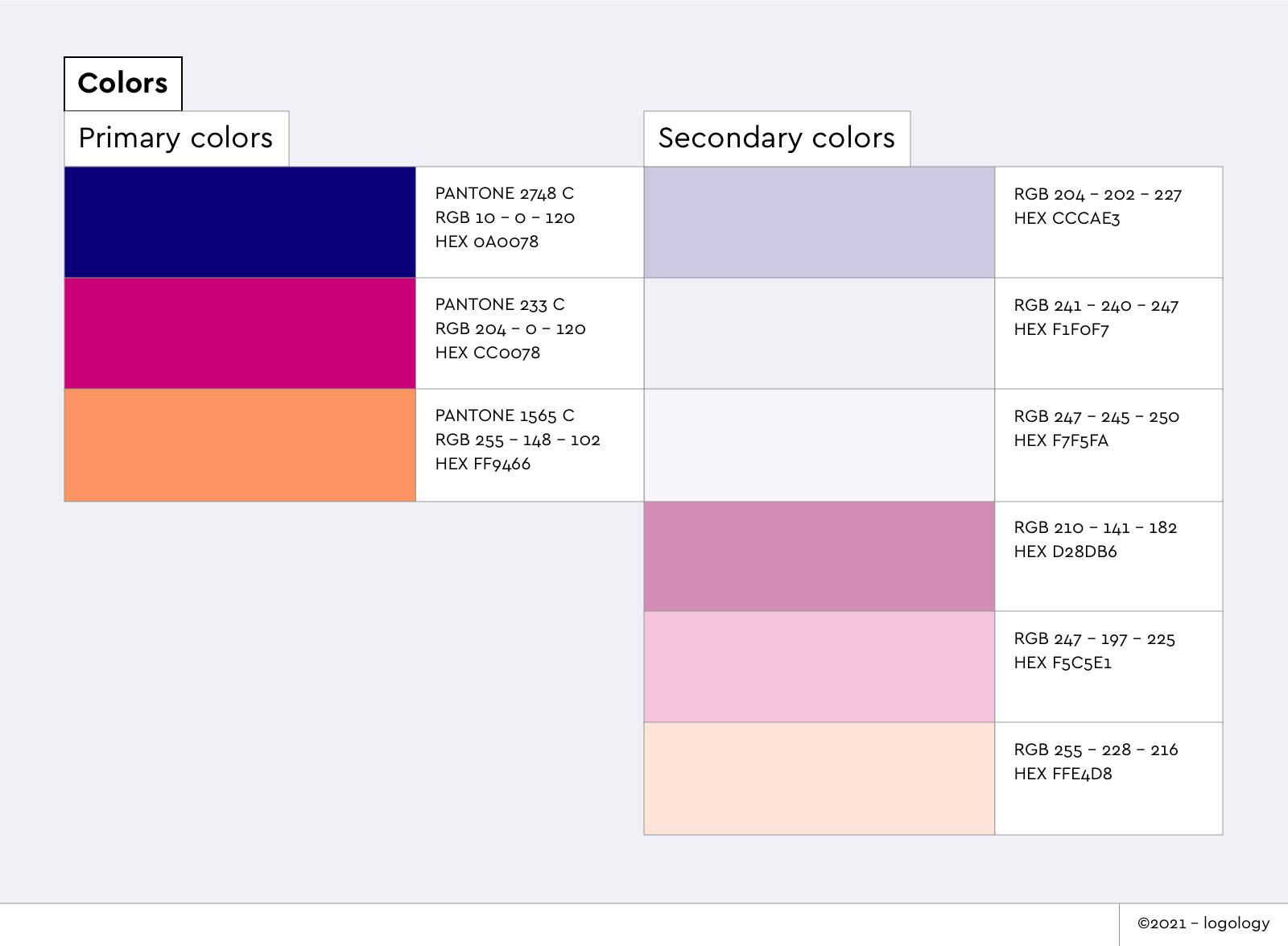
Colors meaning
- The navy blue gives a sense of steadiness, depth, loyalty, and reassurance. The fuchsia, with a hint of purple, conveys pleasure, originality, and assertiveness.
- The orange tone brings dynamism, warmth, and comfort.
Font meaning
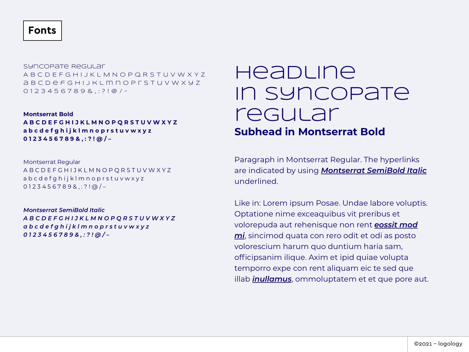
The font is Syncopate Bold, slightly adjusted in its width to be harmonious with the monogram. Sans serif font shows efficiency and modernity. Large widths along with unicase font style convey welcome with a hint of cheerfulness.
6 - Closing thoughts
We loved Jaroslaw’s passion and integrity about his startup. It’s his energy that inspired me to take up the design challenge! So, Jarowslaw, if your read this article: thank you so much again for trusting us with your brand identity design.
He also left a few words about his experience:
“When re-designing a logo for Wide Angle Analytics, we were very keen to try the self-service solution from Logology. The questionnaire quickly helped us produce several truly incredible options. But wanting to push the limits of the design, we engaged the team behind Logology.
The care, attention to detail, and thought process that Lucie and Dagobert poured into the custom design blew us away.
New logo and brand guidelines crafted by Logology helped us build an online identity which we are proud of.”
If you are a curious marketer, looking for a powerful web analytics tool, go check Wide Angle Analytics right away!
And if you’re looking for a meaningful brand identity to stand out from the crowd, try Logology! It’s a fully automated version of my design process, using symbols I created ahead of time for every type of startup.
If you have questions or suggestions, don’t hesitate to reach me. I’d love to have your feedback! I’ve designed a few custom logos lately and I’m about to write about each of them soon. Stay tuned! 🧡