Written on August 4th, 2024 by Lucie Baratte. In how-to.
Hello there,
if you want to learn about branding and how to build a brand identity by getting the most of each of its components, you are in the right place.
If you are a small business owner or a startup founder with no marketing background and a tight budget, I can show you how to get a nice Minimum Viable Brand, and even enhance it. Alongside this article, I’ve also created a free PDF worksheet to support you in the process.
If you are wondering why you need to care about branding in the first place, the answer is just below.
What is a brand?
You might already have an idea by now, but it’s always helpful to get a reminder before digging deeper into the subject.
The brand is the perception others have of your business, and everything related to it: your product or service included. To say it differently, the brand is not your company, or your business, or your product, or your service itself, it’s not just your logo, your slogan, or your brand’s name. The brand is the reflection of your company, its “personality”. A brand is a marketing concept, it is made of a set of elements and subjective perceptions.
Usually, we think of a brand as a concept applied to companies, but personal brands do exist (think of the success of Kim Kardashian for example, she manages her self-promotion as if she were a brand). Indeed, Jeff Bezos (famous founder & CEO of Amazon) sums up this marketing concept in an even more plain way: "Your brand is what people say about you when you are not in the room.”
Why is branding so important?
Brands have a function. A function so essential, brands have permeated our daily lives, they are everywhere. From packaging to apps, advertising to business cards, and so on. Everywhere. In about 150 years, brands have become indispensable. It’s not surprising since they help us choose. Every day, we deal with choices and we make countless choices, many of them without even noticing. We choose between this newspaper and another, between this apple juice and another, between this sweater and another, between this productivity app and another… All day long. Every day of the week.
When we need to spend money on a product (or service), if we hesitate between two options that are almost equivalent in price and performance, our brain will guide us to choose based on our favorite brand. Because we prefer the feeling it gives us.
The competition is fierce, and you have no time to lose.
Therefore, it is essential for any business founder to get a solid and relevant branding. The next question is: how do you establish a solid, relevant brand image?
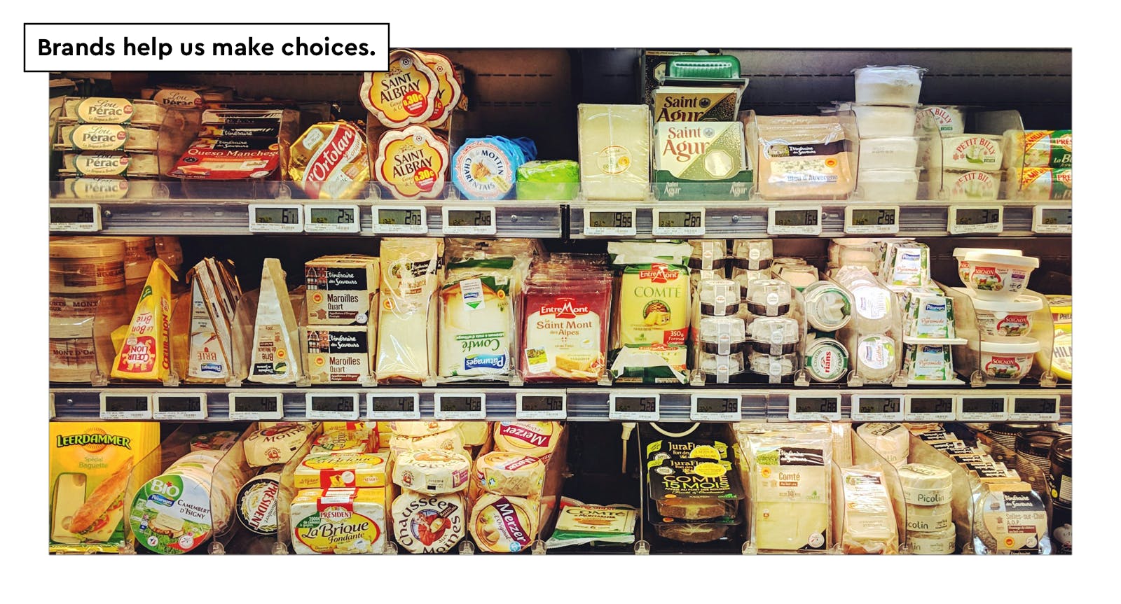
French President Charles de Gaulle once said, “How can you govern a country that has 246 varieties of cheese?” (Actually, France has way more varieties of cheese than that!) Here is a small part of the cheese section in a French grocery store. How many brands can you spot?
(photo: ©Alana Harris/Unsplash)
What should be included in a brand identity and how to design a relevant one?
A brand identity is the seamless fusion of form and function. To achieve it, we pursue the ability to give physical shape to a concept. This is actually what we call “design”. Designing a brand identity is bringing to life an idea, a character — your brand — dedicated to the representation of your business. So, hellooo, Dr. Frankenstein… Okay, things can turn bad, but not if you follow some essentials rules to ensure a positive outcome.
A brand identity consists of various elements, each serving a specific function. When combined, these elements create a cohesive identity that reflects your business. Consider it the toolbox of your brand, guiding and inspiring your efforts.
I’d like to help you envision your brand's ideal identity: please close your eyes for a minute (wait until you read the instructions though). Picture a space that will look like your brand, a place your customers would love to visit. Imagine a store, contemplate the color of the walls, the material used for the shelves, the scent of the place, the brightness, etc. Walk, visit, enjoy.
Take your time, immerse yourself in the experience, and come back when you’re ready to read the next paragraph.
Okay, fine. Happy to welcome you back and thank you for your attention. Now, write down the keywords about your store in the dedicated place on the downloadable worksheet, or draw the main elements on a piece of paper. The sketch doesn’t have to be beautiful, it’s just a reminder. Each time you wonder what is your brand about, you can refer to your notes. Close your eyes and go back to this ideal place, enhance it, or adjust it before taking new action.
The key to branding is turning these keywords, this vision, into relevant copywriting, expressive visuals, and meaningful communication campaigns.
Brand Essentials — The Minimum Viable Brand
Two essential teams: Words and Visual.
Please note that while I may begin with the words section, it doesn’t mean you should do the same. You can start with the visual part if you feel more comfortable. Usually, when creating a brand, the first thing to consider is the name of the brand itself. However, if you lack inspiration, exploring visuals may help. The only rule is to stay focused on one section at a time (e.g., logo or color scheme). Once you’ve finished determining one section, you can move on to another. Imagine a shelf for each component; stay organized. When each shelf is completed, you’ll have a Minimum Viable Brand.
Use the free PDF worksheet to check every brand component.
The Words
Name
Naming things is making them real, making them exist. When a human being is born, his/her family or tribe gives him/her a name. The act of naming is a way of welcoming and recognizing this new person as a member of the community. Some people even think our destinies are encapsulated in our birth names. As for me, my name is Lucie, which means “Light” in Latin. Once a psychologist asked me: “What are you supposed to shed light on?” He was convinced my parents gave me this name for this purpose. (I can’t say he was wrong, but one thing is certain, I was supposed to shed light on branding today!) This is how powerful a name is.
It can take a while before you find the perfect one for your brand. Take your time and choose thoughtfully. These are the main rules of naming:
- a brand name has to be unique. Check that the one you have in mind is not already trademarked, especially in your sector.
- a brand name has to be evocative.
→ By referring to something existing, easy to understand.
eg. MailChimp: “Mail“ + “Chimpanzee” suggests a witty way to send emails.
→ By using sounds that stimulate the imagination (often by repetition of consonance, alliteration, or assonance)
eg. Coca-Cola: double c / double o / double a, the word is already flowing sugar in an energizing way. - a brand name has to be memorizable. Like the title of a book, it’s easier to remember when short.
Copywriting tone
Since you’ll be addressing your audience, your brand needs a specific tone: a copywriting style that suits your brand’s personality and meets your customers’ expectations. For example, if you run a bank, you might want your brand to be perceived as serious and trustworthy. Therefore, it would not be a problem for your customers if your website displays some technical jargon once in a while; it could reassure people that you’re an expert in your domain. On the other hand, if you run a theme park, you want your brand to be perceived as fun and joyful, so your wording should be cheerful and entertaining. Obviously, these two copywriting styles, the bank and the theme park, are not interchangeable.
When it comes to bringing a brand to life through words, there are three main levers to activate:
1 – Vocabulary
Language register and lexicon are useful tools to define a brand voice. Think of your best friend, you like his or her personality, have you noticed the words he or she likes to say frequently? With a few words: a bunch of names and adjectives, you can seize a character, his/her age, his/her social background, his/her areas of interest… He, or she, may also have favorite idioms or expressions like: “You don’t judge a book on its cover” or “No pain, no gain“ etc. Some can even become the mantras of your brand.
Remember your ideal store? Are these words framed on the wall? Are they said by the cool seller behind the counter?
Check the keywords you’ve pointed out about your brand when mentally visiting the store. What kind of vocabulary would suit such a personality? Here are some examples of lexicon for each value:
- Cheerful: fun, hello, nice, friendly…
- Serious: trust, respect, solid, clear…
- Ambitious: great, visionary, disruptive, bold, big…
2 – Story
Since prehistoric times, we, human beings, are addicted to fiction. We love to hear a good story, we love to believe in beautiful ones, and our imagination is never at rest. Stories are very powerful when it comes to gathering people.
Your brand also has a story to tell, a narrative that can inspire your audience. Don’t make it complicated; begin with a sentence or two. Give your customers an indication of who your brand is, why it exists, how it came to life, and, most importantly, what your brand wants to achieve—its mission, its purpose, and the meaning behind its actions. You’ll see that, like everyone on this Earth, when we get attached to a character because they have a mission to fulfill, we can't let go until we see a resolution. The rest is about managing suspense...
Some company stories are so appealing that Hollywood producers have turned them into bankable movies. "Based on a true story." Here is an example: Who wouldn’t love to learn about the success story of a young student—brilliant but solitary and underrated by his classmates—who, with a plain look and a desire to achieve something great, shows his inner greatness? He struggles, some people suffer, but in the end, he becomes known as one of the most influential individuals of our time. Indeed, he founded Facebook. (No need to explain the importance Facebook has had on online humanity.) The film is called The Social Network. Directed by David Fincher, it was released in 2010.
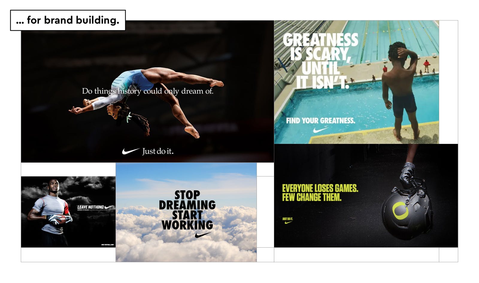
To close this part of our narrative exploration, think about these brands: Coca-Cola? A secret recipe, kept for a century, for the delight of true soda enthusiasts. Nike? A brand that repeatedly tells stories about inspiring winners, resilient athletes, and determined champions.
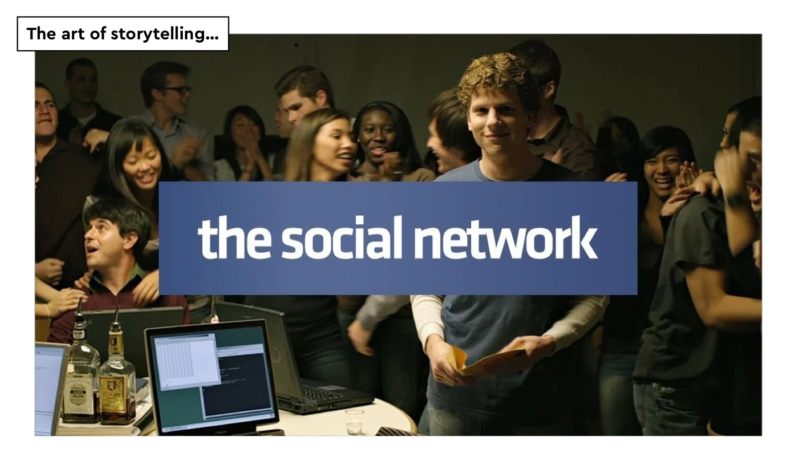
©SONY PICTURES RELEASING FRANCE
3 – Pronouns, personal names, emoji, and punctuation
Will your brand address your customer by writing:
“Dear M. [Family Name],
we are delighted to inform you that you’ve been chosen as customer of the month.
Best regards,
The team”
or would you instead write:
“Hi [First name],
I’m happy to announce you that you are our customer of the month!
Cheers,
[First Name]”
?
Here is another useful tool to build your brand. Choosing “we” rather than “I”, using family names rather than first names, punctuating the sentence with a dot rather than an exclamation mark, all these, so-called, details, indicate the tone and personality of your brand. There is no good answer here, only the most suitable solution according to the message you want to deliver. Remember that, in any case, the purpose (beyond the email itself) is to communicate your brand identity to create an emotional, trustworthy bond with your customer. Evaluate the best solution from this perspective.
Emojis have become a useful tool for universal communication, adding sensitivity and humanity to conversations all over the world. During the first COVID-19 lockdown, when face-to-face interactions were limited, researchers noticed a significant increase in emoji usage. However, it's essential to consider the context and the person you're communicating with, as being overly emotional and informal with the wrong person may cause discomfort. Moreover, using too many emojis may create confusion about the intended meaning. In some cases, it's better to clarify your thoughts by enriching your vocabulary.
The Visual
Logo
Serious talk here. Right after the actual name of your brand, the logo is the most important component of your brand identity. Whenever it’s called a logomark or a logotype, a logo is the graphic representation of your business. It identifies your brand in a second. As surely as your signature at the bottom of the contract indicates your approval. The logo is the visual signature of your brand. This small piece of information is, most of the time, the first encounter between your potential customer and your brand, and the more frequent. It is your chance to make a good first impression, as the logo conveys the essence of your brand personality. You can build a company without a logo, and you can even sell products without a logo, but this is not marketing, this is not having a Minimum Viable Brand. You can’t successfully go to market without a logo.
A logotype is a powerful key element of your brand communication; it will appear on almost all assets: website, email, labels, profile pictures, packaging, and more.
The good news for early entrepreneurs with tight budgets is that a logo can evolve over time, it doesn’t have to be perfect right away. However, there are two required duets of qualities of a good logo you can’t avoid:
- legibility & efficiency (functional aspect): the sign has to be understandable and recognizable within a glimpse, in color or in black and white, in large or small size. Consequently, most of the best logos in History have been designed with simplicity and clarity. A logo is no diagram or book illustration.
(e.g., Nike, Apple, LG.) - symbolism & evocation (emotional aspect): the sign has to be the mirror of your brand values. The power of the logo dwells in its ability to be meaningful, to tell us a story, and to bring out emotions.
→ Its concept has to be well chosen. What will evoke to you and your audience: a bird in flight, a roaring lion, or an abstract form?
(e.g., the winking chimpanzee of MailChimp and the squares of Microsoft.)
→ Its design has to be thoughtful. The shapes imply connotation. A rugged style will evoke authenticity while a minimalist design will emphasize on simplicity.
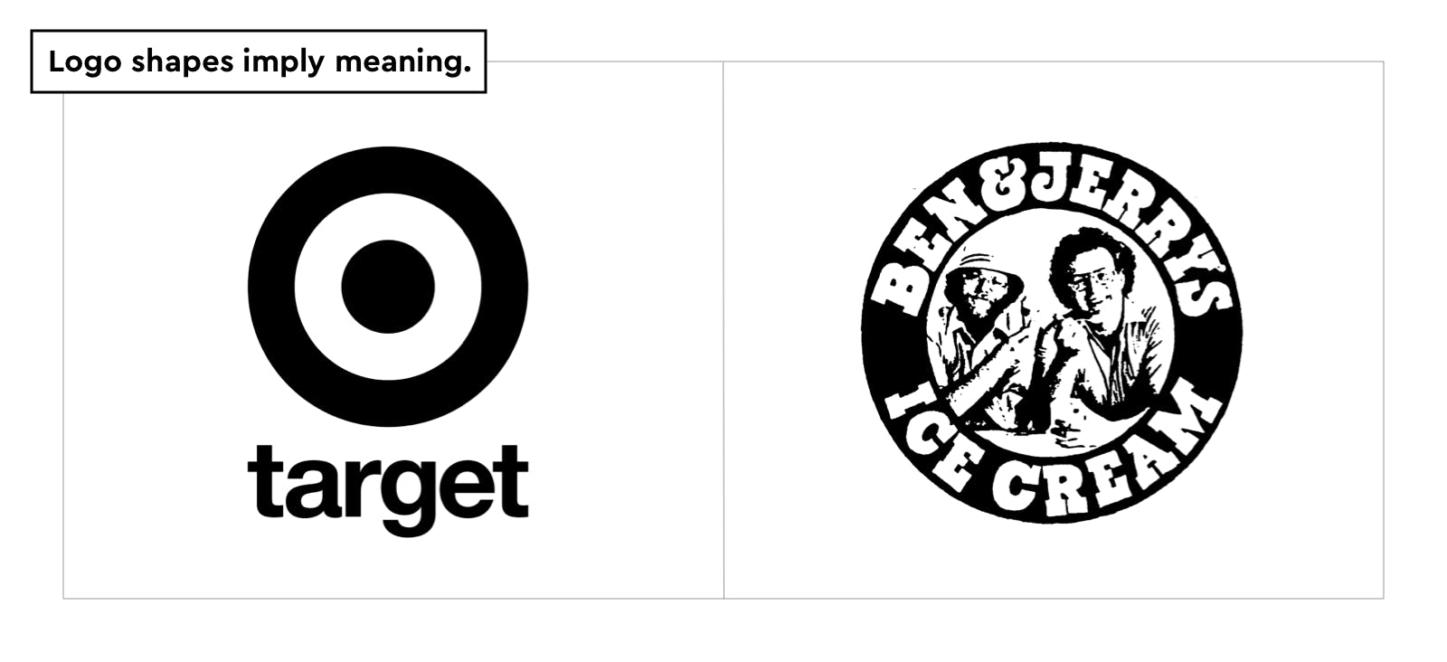
A logo can be found in various versions, according to use: symbol only, in black and white, in colors, on dark background, etc.
Lastly, be cautious not to damage your logo by using a low-quality file or distorting it. Keep high-quality, large-size files of every version of your logo as master digital copies. Vector files (.svg, .eps) are the best options since they can be enlarged without compromising quality.

If you feel the need to change your logo in the future, evaluate the situation carefully. If the core meaning of the logo still aligns with your brand's values, a subtle design modification can suffice to make it look more modern, original, or bold, or to convey any new feeling you want to express. If you realize you need to pivot your brand voice and personality, it's no problem. Change the colors, the font, or the symbol itself while retaining an element from the previous version; this will help your customers transition to the new one smoothly.
Color palette
Did you know colors could be trademarked? It’s the case for Post-It yellow, Barbie pink, and Cadbury purple. This is how important colors can become for brands. Because their power of evocation and emotional response is so intense. Maybe you have a favorite color yourself, or maybe you know a friend or a family member who loves red, purple, or deep black? or even Coca-cola’s red, Taco Bell’s purple, and Nike’s straightforward black? It’s amazing how we can feel connected to a color and be instantly attracted by it. The idea is not to choose your favorite color for your brand but to evaluate the best one to communicate with your audience based on color meaning and emotional impact.
Colors reveal the mood of your brand (remember your inside ideal store). Will it be joyful yellow, calm blue, or extravagant purple?
For a Minimum Viable Brand, you need:
- 1 or 2 primary colors.
These colors will be the ones used in the logo.
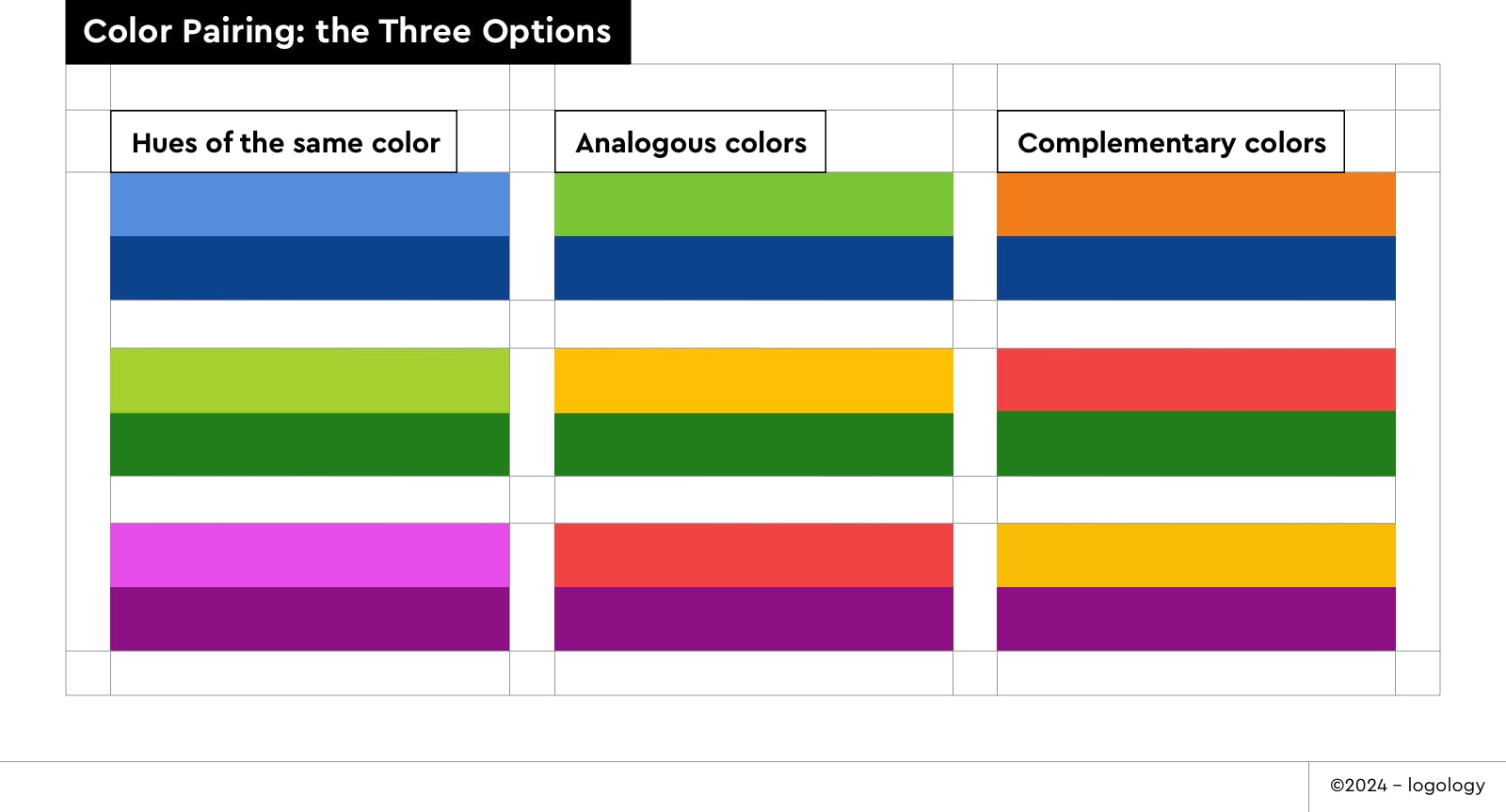
3 options here:
→ the 2 colors are hues of the same one (e.g., pastel blue + deep blue). The combination will look naturally harmonious, with a demeanor of simplicity.
→ they are analogous colors (e.g., red + orange, green + yellow, blue + purple). Close friends on the chromatic circle, these tones will fortify each other moods.
→ they are complementary colors on the chromatic circle (e.g., red + green, purple + yellow, blue + orange). This means their association will feel contrasted and therefore bring a sense of boldness or dynamism.
- 1 or 2 secondary colors.
You can never be wrong by picking a lighter or darker tone of the primary colors of your branding.
Font & Hierarchy
Far is the time when human beings had to copy every book by hand to spread knowledge, poetry, and political ideas. Today, mechanical writing, made possible by technical innovation, has replaced the old ways. We call it typography. Fonts are typographic tools, very useful in daily life for texting messages or writing emails. We find fonts everywhere from road signage to milk bottles. As soon as there is text, fonts are essential to any visual communication. You can’t avoid them.
Moreover, fonts carry another benefit beyond allowing us to send messages without using ink & feather: a more subtle one. Their letterforms convey feelings and expressions. Even when they are very classic, they evoke classicism.
Therefore, fonts are precious components for your brand design.
To get the most out of typography’s power to deliver a message, you have to pay attention to letter sizes and distribution on screens or pages. The bigger and bolder a word is, the more catchy and important it looks to the viewer. On the contrary, if you want to read the small text at the bottom of a movie poster, you’ll have to get close or put your glasses on (and maybe both). These are the basic rules of visual hierarchy: content is organized to help readers navigate through information. Many graphic and typographic options exist to emphasize or minimize parts of the message. But, in a nutshell, only one rule prevails: contrast. Contrast is the key to typographic success. Big titles and small captions will always be more efficient than mild titles and "not too minuscule" captions.
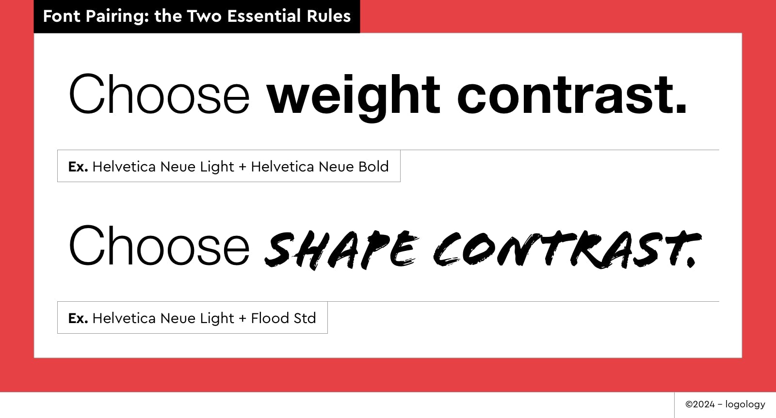
You need at least one font, but I advise you to pick two. It will be easier to create contrast this way. Each font must be attached to a function of communication. In a Minimum Viable Brand, you have three:
1 – The logo
In this case, the typeface is a chief ambassador of your brand, along with the symbol.
2 – Headline
Here you need a heavy font — whether it is by size or weight — the words have to be visible at a glance.
3 – Body text
For which you mostly need a legible font (rather than a fancy one).
The primary font will be the one for headlines.
You can either keep the one from your logo (the most convenient solution) or choose a completely different one.
The secondary font will be used for body text.
Make sure to evaluate its legibility and compatibility with your logo’s typeface.
Adding more fonts to your brand identity:
As you can see, pairing two fonts is already a skillful exercise in balancing aesthetic harmony and setting the relevant mood. However, you can easily add a third font by selecting a specific weight of your secondary typeface family. For example, if you use Font Regular for body text, choose Font Italic for captions, or if you use Font Light for body text, choose Font Light Italic for captions. But, adding more fonts to your brand identity can become a tricky path. The more you add, the more dangerous it gets for the clearness and legibility of your visual identity.
I must warn you: some fonts are almost impossible to use for a brand identity. Be careful with (free) display fonts in general. If the letters are literally made of figurative shapes, like human bodies, pencils, or plants, it means the typeface is too illustrative for the sake of your brand. Too complicated, with too much to look at, leaving insufficient space for the meaning of the word itself. Evaluate the legibility of the font you fancy: if the forms are hard to read, it might not be a good choice. Moreover, concerning your logo, if the font is extremely expressive (overly original), don’t try to associate it with a symbol (logomark), it would be too loud and too heavy to be understandable.
One last tricky font case: avoid widely disliked fonts. Some fonts, for various reasons, are generally associated with bad taste. Only bold designers or type design experts can manage to use them once in a while. The most famous disliked font is probably Comic Sans MS. Select it at your own risk…

How and where to apply the components’ rules?
Once you have established the brand essentials, your Minimum Viable Brand rules must be applied across every medium: app, website, packaging, social media posts, commercials, etc. In short, everywhere. But just as you are building a consistent brand step by step, keep your focus on the main domains of application. Product and website come first. Social media can wait.
Check the words, colors, and fonts for consistency. Ensure the logo is undistorted and visible enough to be legible. If you need to add colors or fonts, be cautious: ask yourself how you can do more with less. If you really have to add something, consider how this new element will fit with the rest of the brand design. Re-read your texts to remove typos and grammar mistakes.

These are the basics of brand identity. Once you’ve defined them, stick with them, at least for a while. Use the same color scheme on every document related to your brand; colorize the pictures if needed. The more you stay focused and disciplined with your brand components, the better the chances of your brand being identified and remembered by your audience.
Therefore, you can now add more elements to the main teams, Words and Visual, you can also play with new teams. These are not absolute necessities for a "minimum viable brand," but they can bring significant personality and depth to your brand and are worth considering. The more elements you use to engage your audience, the greater your chances of being remembered, visible, and loved (as a brand, always). However, the more components you add, the greater the risk they won’t fit together. The last thing you need when building a brand is dissonance. o my advice is: once you have determined the essentials of your brand, pick a new element from the selection below, work on it, see how it matches the rest of the puzzle, stay focused, and once you have it, you can pick another one.
Brand More
Within the main teams, Words and Visual, there is still a lot you can add to enhance the strength of your brand.
The Words
Tagline
If you succeed here, your tagline is actually expressing the positioning of your brand. It can look like a mantra (eg. “Just Do It”).
The Visual
Explore the land of visual vocabulary. It’s a vast world out there where you can pick a few components as you would with flowers.
1 – Shapes
- Lines, forms, and edges
- Textures
- Patterns
2 – Picture Style
- Illustrations
They can be didactic or inspirational, multicolored, or black & white. - Icons
Icons are specific type of illustrations. They’re small and simple. - Photography
- Videos and animations
Never forget to check the copyright of the images you’re using!
The Sensitive
1 – Textures
As Saint Peter says, "God is in the details." Luxury brands have mastered this lesson to make their customers feel like they've reached heaven. If you're designing physical products or running a store, you should consider this. In the world of sensory marketing, textures play a crucial role in leaving a lasting impression on your audience. The feel of raw wood or polished metal evokes distinct emotions and associations, enriching a brand's essence. Business cards, flyers, and gift cards must meet the same requirements. Your creativity here can make all the difference! Are you running a startup dedicated to outdoor activities? Opt for grainy, recycled, or organic paper. Are you planning on selling expensive custom outfits? You might choose a soft-coated sheet with a spot gloss.
2 – Sounds and music
According to your business, the musicality of your brand can have a positive impact on your audience. Sounds are powerful tools to create significant associations with the brand, making it more memorable and enhancing the overall user experience. Think of Netflix for example, can you feel the excitement that goes with its Taadddaaam sound? Each time you launch a video, you hear this. So, after a while, each time you hear it, you remember Netflix and the pleasure you had watching the last episode of your new favorite show. If you run a podcast, or if you’re considering launching a branded podcast, your jingle will have the same kind of emotional effect on your listeners. Now, think about the sound of app notifications, whether it’s Slack, Shopify, or Twitter. they’re not only useful, they’re distinctive; they have their own audio identity. Your brain relates them to the brands.
To achieve this, you can draw inspiration from the features of your Minimal Viable Brand, asking questions like: what would a “red” melody be, or a “soft blue” noise? Imagine a tone that would look like your logo, font(s) and/or visuals. What would a “sharp” sound be, or a “rounded” one? By thinking about sound design in this way, you’ll define an audio identity that aligns with your wording and visual identity, strengthening the overall brand recognition and emotional bond with your audience.
3 – Tastes & smells
Obvious need if you are in the food or perfume business, but otherwise, let’s be creative! Smell can arouse strong emotions and fancy memories, and to “taste a brand“ requires a deep bond between customer and product. But they both allow the brand to be embedded as a pleasing experience in our satisfied brains. I’m sure you can relate to the particular taste of your childhood industrial biscuits or the delicate perfume of brand-new toy box under the Christmas tree. So if you have the opportunity (or the necessity) to use it, you should give it a try.
Take, for example, Innocence, a French company of online photo printing. For each order, they send a greeting card, delicately perfumed. The fragrance evokes childhood and cherished memories, what could be better to suggest that Innocence is not a mere photo printer but a a keeper for memories?
The Gesture
Allow me to specify as an introduction the differences between brand gestures and communication campaigns. Brand gestures are subtle, personalized actions that enhance customer experience and foster loyalty. Communication campaigns are coordinated efforts promoting a brand or product to a broad audience, focusing on raising awareness and driving sales. Both play a role in building and maintaining a brand identity but differ in approach, objectives, and scope. The branding strategy of communication campaigns could be the topic of a future blog post, but for today, let’s focus on brand components only.
1 – Special interactions with the audience
Every brand's secret desire is to be cherished by its audience like a family member. To achieve this, a brand can include specific ways for its employees to address the public. For instance, if you order a meal at one of the 3,059 Chick-fil-A restaurants and thank the waiter, he will reply, “My pleasure,” instead of “You‘re welcome” or “No problem.” This sensitive gesture has become famous to the point it embodies the positive and kind energy of their customer service. Beyond the phrase, Chick-fil-A's brand is talking through this special interaction, showcasing its feel-good mood.
2 – Location
Never underestimate the power of location in shaping your brand's perception. The chosen neighborhood, along with the interior design of your office, store, or coworking space, speaks volumes about your brand values, community, and ambition. Whether it's a sleek, minimalist office space that reflects innovation and efficiency or a cozy, rustic setting that suggests warmth and authenticity, your location's design should be an extension of your brand story. Invest time and resources into crafting a space that not only stands out but also resonates with your target audience. And, hopefully, as you work in it, you'll feel immersed in your brand, reinforcing your sense of belonging. It's an effective way to enhance your daily motivation as a business founder!
3 – Special attention to the client
Last but not least, showing special attention to your clients can be a game-changer. Personalized gestures, like greeting cards, create a sense of exclusivity and genuine care for your customers. Your brand's philosophy should emphasize the importance of client satisfaction and prioritize making them feel valued. This could involve sending handwritten thank-you notes, offering tailored recommendations, or going the extra mile to ensure a memorable experience.

Where to invest to build specificity & strength for your small business brand if you don’t have a lot of money?
In the early stages, when your budget is tight, it can be very challenging to create a brand that stands out from the crowd. Obviously, you can’t invest in a wide variety of components. However, investing in a single, well-chosen component alongside your Minimum Viable Brand package can be a game-changer. So, if you're thinking about spending a few bucks on branding, here’s my advice on how to make the most of it.
If your business is a startup and the main access to your product or service is through your website → boost your brand with original pictures (illustrations, photography, or use of icons). When someone checks on your website, the first impression they get is the visual mood of your landing page, and the first thing they will identify as the mood is the main image upwards, just beside your baseline. As a brand, you have an opportunity here to make a great first impression. Nowadays, a lot of landing pages tend to look alike because every startup founder is using the same image databases. Let’s find another path—invest in uncommon illustrations or a photoshoot. It may be more expensive than a mere database but it’s worth it. Your main competitor is using photos? Fine, use watercolor illustrations (if their style matches your keywords, of course). Users and customers will more easily distinguish your brand's voice as unique and remember your website for its special mood.
If your business is small and the main access to your product or service is through your physical store (e.g., restaurants, hand-made jewelry…) → boost your brand with a sensitive touch or gesture. It’s not necessarily expensive, on the contrary, it’s mostly creative. For example, think about the specific smell or touch of your gift packs. Can you add perfume? Can you choose a delicate paper? Another example: when you deliver the bill to the client, could it come with an original, yet simple, sentence, card, or candy? This attention to detail can bring pleasure to your customers, and these little touches will be the reason why they remember your business and feel attached to it.

Go To Action
Now that you have arranged the different components to create your brand identity, your business is ready for marketing! Your inside brand store is ready to open to the public! Bear in mind that your brand will only exist if you consistently use the components. This means always using the same color scheme and fonts, displaying your logo on every relevant occasion, and maintaining the same copywriting tone. Imagine for a second a store that changes its storefront every week—it would be impossible for customers to find their way around. Time is your ally in building a strong appealing brand. Stay focus and persistent.
And if one day, you think your brand needs a makeover, go back to square one: imagine your ideal place, and reshape it following the same process. If you need a brand components worksheet, you can download again the free one I’ve designed for you.
Thank you for your attention! I hope I helped you elaborate your MVB : Minimum Viable Brand. If you’re still looking for your logo, colors, and fonts, take a shortcut: try our brand questionnaire and let the magic happen!
You can also share your thoughts and suggestions about this article on Twitter, I’d love to hear from you.
❤️
Lucie Baratte
happy art director & founder of Logology