Written on May 21st, 2019 by Lucie Baratte. In logo decrypt.
Today, we take a look at the logo design of the French brand Lacoste.
History
René Lacoste was a French tennis player born in 1904. He started playing at age 15 and had a very prolific career between 1925 and 1928, playing 51 Davis Cup matches for France. He became the world number one tennis man, going from one victory to another, due to his legendary tenacity.
According to Lacoste himself, his idea for his nickname began with a bet with the captain of the French team about a crocodile leather case in Boston. After that, the public and reporters started calling René Lacoste after the animal because of how he dealt with his opponents. René Lacoste was aggressive on the tennis court, as a crocodile would be! He founded the brand Lacoste in 1933, which is now very well known as a high-quality textile brand.
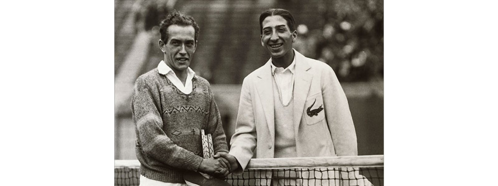
René Lacoste sporting his signature crocodile on the left pocket of his blazer. ©Underwood & Underwood/Corbis
Pictogram
The crocodile has been chosen as the pictogram of the Lacoste’s brand. The idea of the pictogram may come from a tennis shirt he received in 1926 with the animal embroidered on it during his career, designed by Robert George. After many trials for his brand, René Lacoste chose the version we know today where the animal is designed in green with a red mouth. The design has been refined through the years but the essential features stayed the same.
First, the colors. Red & green are complementary, which reinforce the strength of the red and increase the aggressiveness of it. The green reminds us of the original colors of the animal. With a green crocodile, the brand sounds more authentic, natural. The combination of the two makes it very easy to remember.
Second, the aggressiveness. The crocodile is moving (look at his tail!), the mouth is open and he is looking to his right. A moving animal with an open mouth is reinforcing the strength, power, and aggressiveness of the brand.

The Lacoste crocodile designed in 1926 by Robert George. ©Lacoste

Today’s famous Lacoste polo shirt with his signature crocodile. ©Lacoste
Font
The font is sans serif and has a regular weight. Here Lacoste wants to tell us that their products are rooted in modernity, efficiency, we could even saychic. The weight of the font is slimmer than the previous one (from 1984) which shows the strategy change of the brand in the last few years. They now target a larger audience and may be trying to be less aggressive or less selective. The letters are still black though, clearly, Lacoste wants to keep his image of sobriety and elegance, we could even say luxury. The brand name is always in capital letters to show authority, Lacoste being 86 years old. It also implies solidity.
The big picture
The branding of Lacoste is clearly mapped on the reputation of his founder:“French chic”, dynamic & aggressive. The logo is based on the fierce symbol of the crocodile and the solid simplicity of its fontdesign. It affirms, withchic, how efficient & strong the clothes of the brand are.