Written on February 25th, 2021 by Lucie Baratte. In logo makeover.
Hello there, today I'll be reviewing and enhancing the brand design of handleDroid.
1. Foundation: The values behind HandleDroid
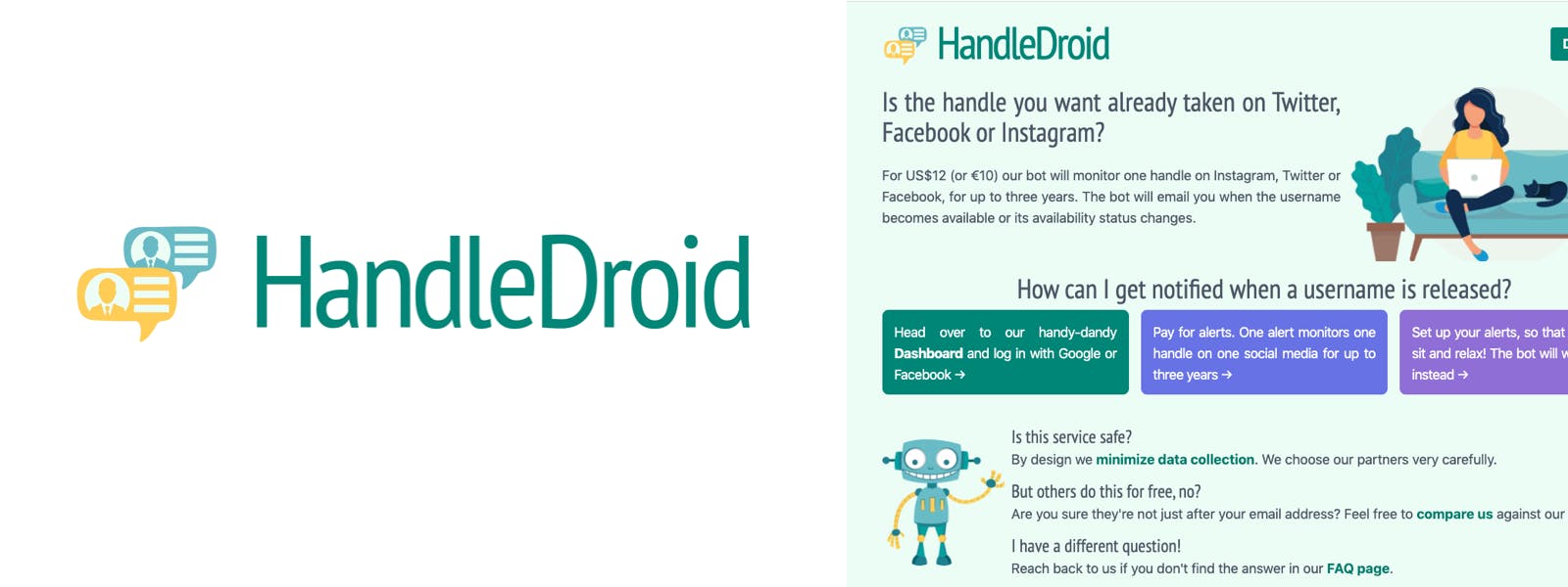
HandleDroid is a service that notifies you when the availability of a username you want changes on Twitter, Facebook, or Instagram. To do so, their bot will monitor one handle for up to three years. Their core values are to be simple, easy to use, and reliable.
2. Good things about the current logo
- The idea behind the symbol is nice and simple: it combines the image of a social media identity with a sense of depth and repetition. This perspective effect suggests automation and time.
- The symbol explains in one piece what "HandleDroid" is about, and makes the name clearer. It's a good thing as they want to convey simplicity and reliability.
- The colors bring a good balance between reliability (dark green and blue) and a human, sensitive feeling (turquoise, soft colors).
- This balance can also be found on the rounded lines associated with a condensed font (PT Sans Narrow).
- Since HandleDroid can be assimilated with a robot, I think it is very interesting to keep the human feeling alive and not get rid of the kindness behind the tool.
3. Issue with the current logo
Trying to explain what the product is through the symbol is good but in this case, the design is too complicated and verbose to be understood properly. It doesn't convey simplicity and ease of use.
The current logo is difficult to read, especially in small size. The letter-spacing is too tight and makes the word harder to read.
4. Improvement solution
To enhance the actual logo, we need to keep the seriousness and the educational style of the symbol, along with the flexible lines and the human feeling. However, we also need to clarify the drawing and give it more strength.
Designing the new logo depends on this question: how to express simplicity and reliability and still convey kindness?
5. Design ideas
I've made a lot of sketches to experiment bringing strength and clarity to HandleDroid in a soft, easy way.
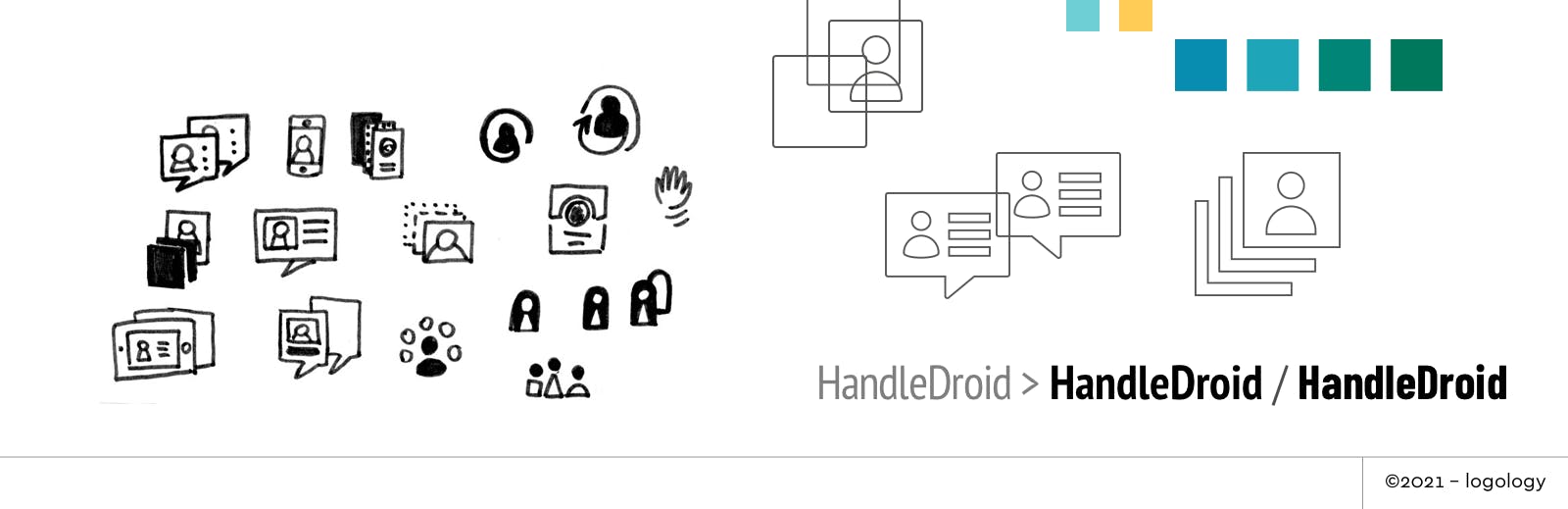
Symbol
- Simplify the "user ID card" by getting rid of the details: try to be less talkative and more effective.
- Try other ways to display perspective and depth: going from dots to full lines or adding a third card to insist on multiple ids.
- Try other designs for "user ID card" than the speech bubble: smartphone, cards, pawns…
Colors
- Keep the green with a hint of blue, to keep the softness alive, but try a deeper tone to insist on reliability.
- I also tried a blue hue, with a hint of green for the kind feeling, it conveys simplicity and seriousness.
Fonts
- Use a thicker weight (bold instead of regular) to add strength and solidity.
- Try another condensed font with a little less flexibility and more stature.
- Adjust the letter-spacing: when the weight of the font is ok, no need to tighten the spacing to add visual impact.
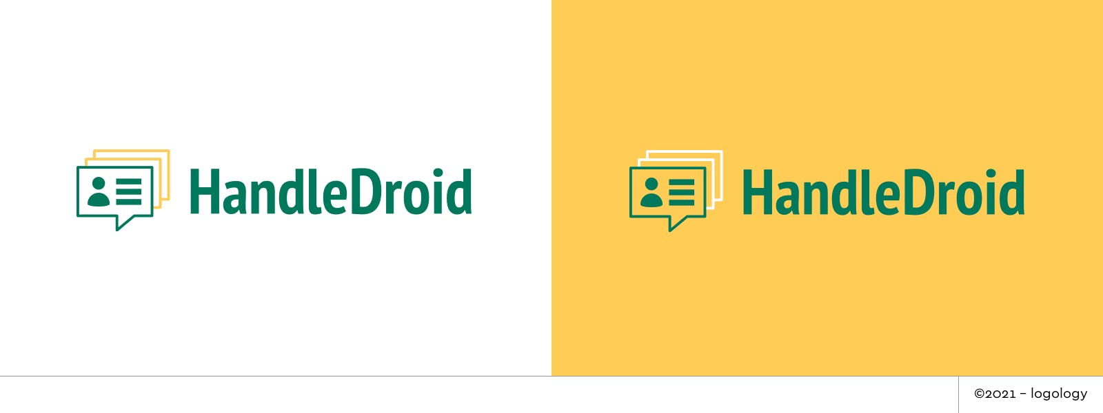
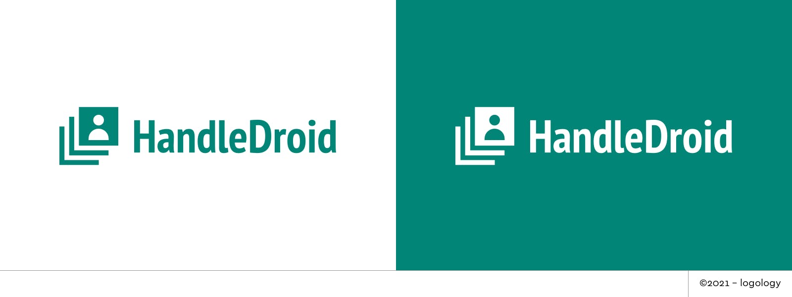
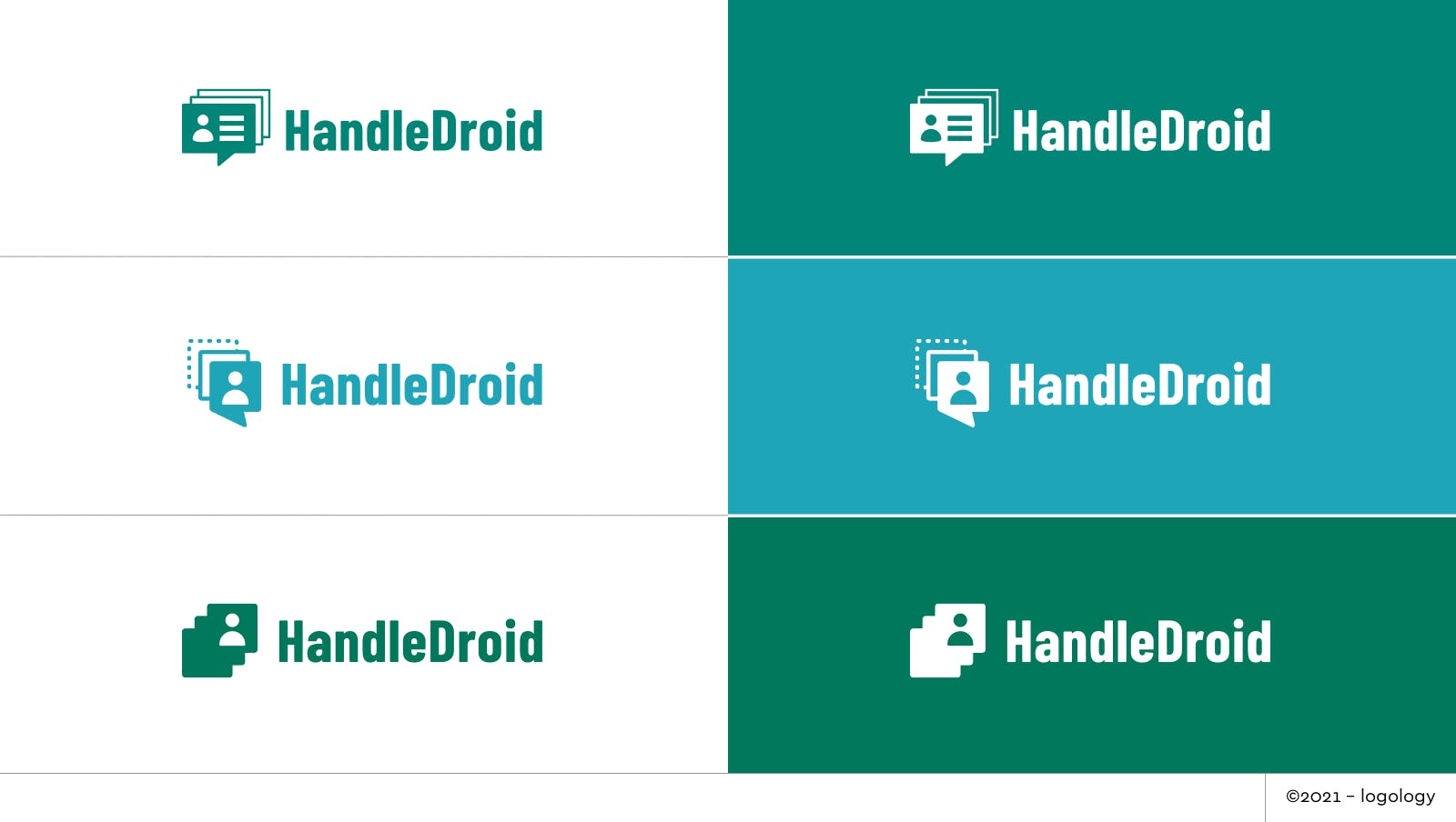
6. Logo Proposals
I applied all these ideas in the four proposals below.
Font: I picked PT Narrow Bold and Barlow Condensed Bold, according to the symbol.
Colors: I kept the deep green, but enhanced it with a more intense connotation.
Shapes: I chose a minimalist design with straight lines, rounded edges, and perfect circles.
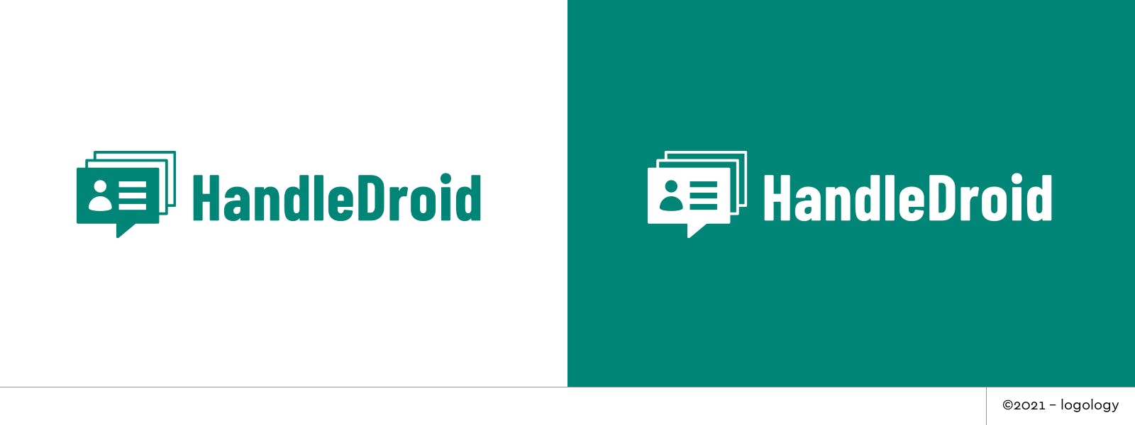
Proposal 1 – User identity and bot tracking
This proposal keeps the idea of associating "user identity" with automation and perspective. Here, the message is the same, but the design is clearer and the legibility is enhanced.
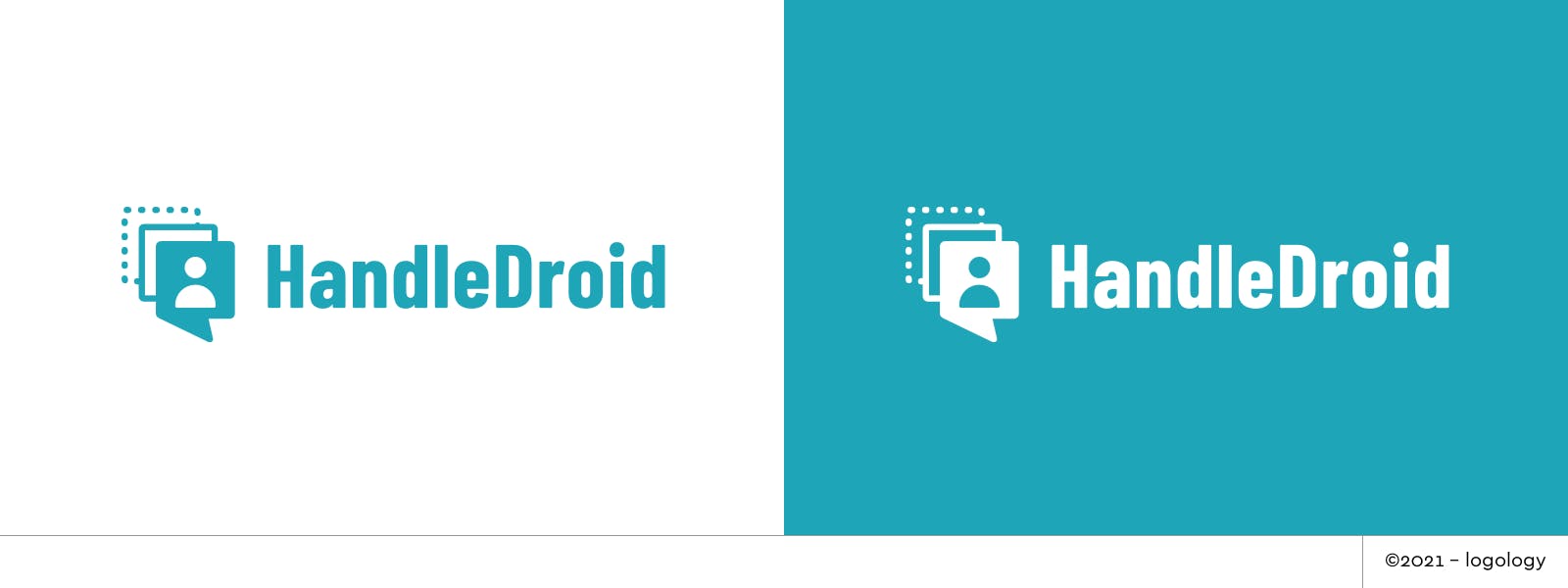
Proposal 2 – Through time
Going from dots to a fully colored "user profile" evokes the duration of the search. The design expresses the idea that you finally get the profile you want thanks to the bot's work.
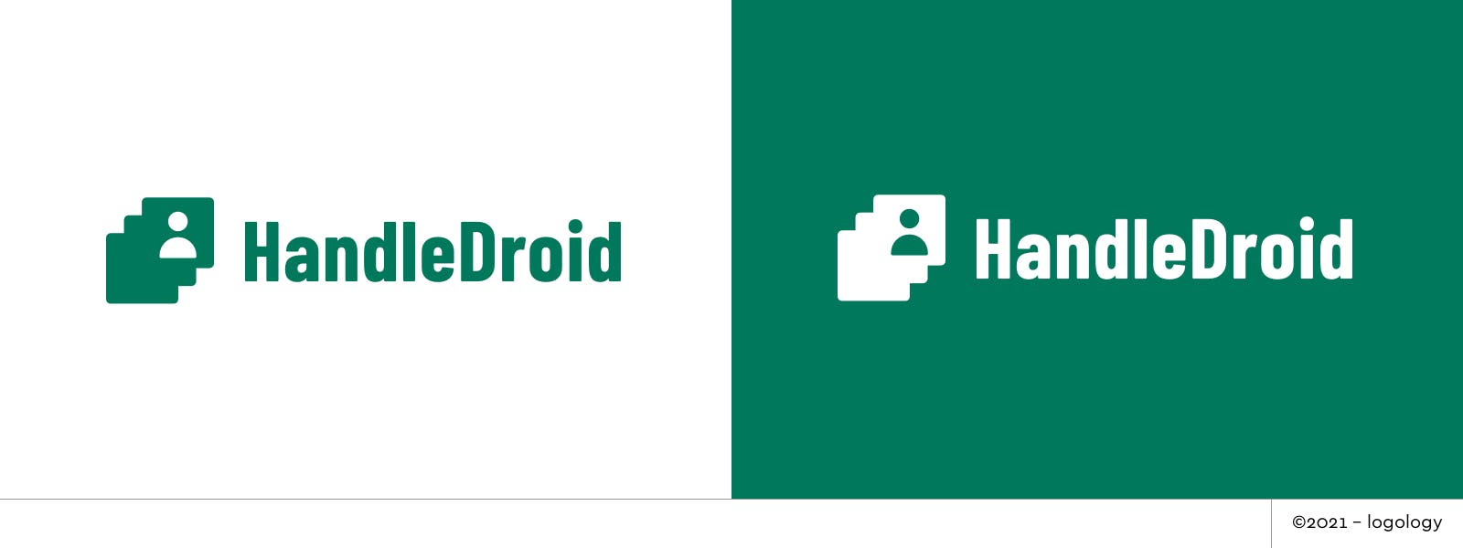
Proposal 3 – Finding a match
The cards are melted into one shape, or repeated, to express depth and a perpetual search.
7. Recap
The HandleDroid logo case was nice to work on! Next week, I'll enhance another logo. Stay tuned!