Written on February 19th, 2021 by Lucie Baratte. In logo makeover.
Hello there,
For this first edition, I've looked at the brand design of Bolt. They started out with a pretty good visual identity already, so it was fun to figure out ways to make it stronger.
Let's get started.
1. Foundation: the values behind Bolt
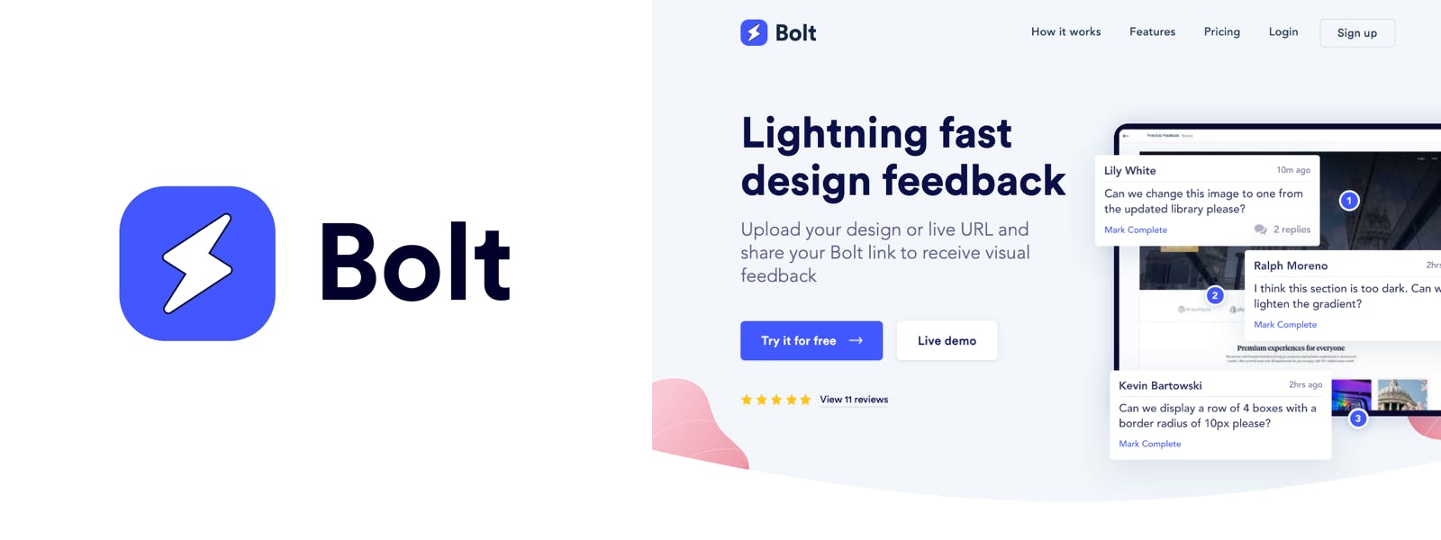
Bolt is a SaaS that makes it easy to collect visual feedback from clients and team members on live sites and static designs. Their core values is to be powerful but lightweight, fast, caring about customers and disruptive.
2. Good things about the current logo
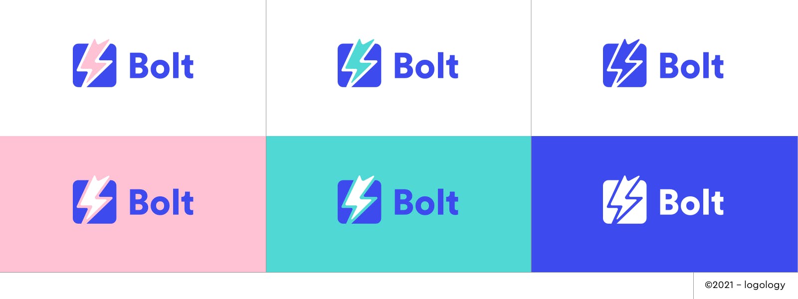
- The design conveys modernity and efficiency through geometric lines and simple shapes. They match the values of quickness and disruptiveness. They also have this contemporary ux/ui design feeling which fits nicely in the world of design apps.
- The font they chose has all the qualities that they're looking for: modernity, legibility and a smart hint of originality. Look at the "t", it looks like it's smiling. It's a great type design by Laurenz Brunner, I love it!
- The colors are interesting: electric blue gives a sense of energy in a reliable way, and soft pink (from their landing page) balances it with kindness and warmth in an original way. They match well with their values of "powerful but lightweight" and of "caring about customers".
- I like the idea of using a rounded square, it gives a caring demeanor to what appears as a solid solution: stable and reassuring. The square also suggests the feedback board or the website screen design.
- It's a good idea to choose a lighting bolt as a symbol since the name of brand is Bolt. It makes the name of the brand more memorizable.
3. Issue with the current logo
Since they're using a symbol that matches their brand name, without adding anything to it, it doesn't create a strong emotional bond with their audience. The current logo doesn't tell enough of a story to be remembered. It looks too generic.
4. Proposed improvement
To improve the actual logo, we need to keep the modern, simple, rounded feeling of the brand, but we also need to make the "bolt" mean something. What makes this "bolt" so special? What is its originality?
5. Design ideas
I've looked through different ways to give Bolt a hint of more originality and "craziness" through design.
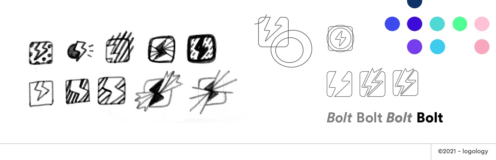
Symbol
1. Try a lightning bolt that gets out the box or shakes.
2. Try to put the lightning bolt is an different surrounding: dots, curved lines, circles, stripes…
Colors
Keep the blue, and eventually soft pink, but try to bring more originality by using a turquoise blue (caring+innovative) or a purple-blue (bold+creative).
Font
Use a thicker weight (black instead of bold) to add power and confidence.
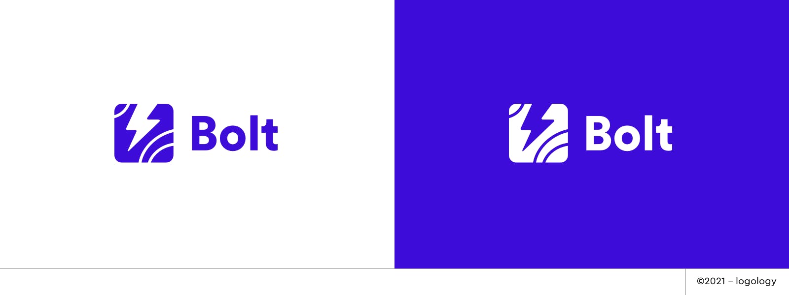
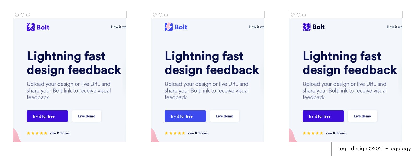
6. Logo Proposals
I applied all these ideas in the three proposals below:
Font: I picked Circular Std Black for the word "Bolt", to give it more strength.
Colors: I kept the blue but twisted it with a more intense connotation.
Rounded square: I redesigned the roundness to look more solid, without losing of the caring feeling
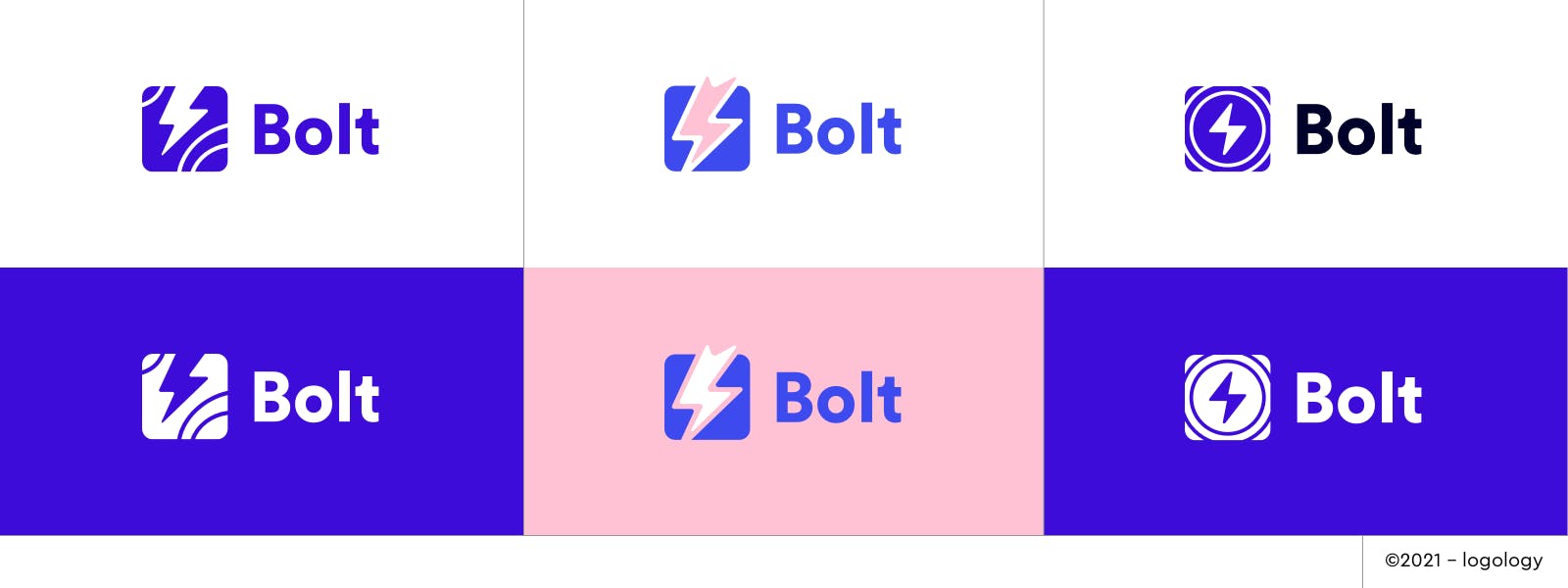
Proposal 1 – Lines and space
The curved lines symbolize design and imagination. Coming from the outside of the box, the lightning bolt appears as a tool to get deep instant energy.
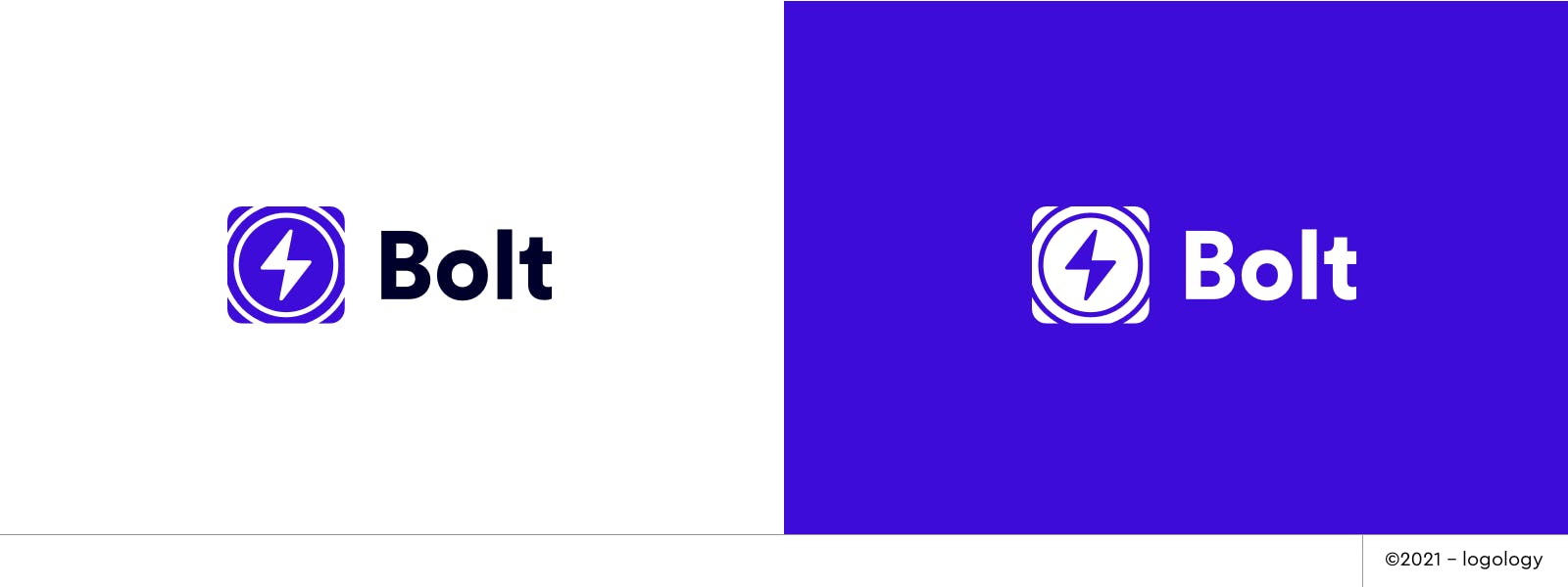
Proposal 2 – Powerful lightning bolt
Placed in the center of the squared board, the lightning bolt conveys intense energy and power as its design seems to bring angles and sharpness. I smoothed-out the lines to balance the strength with a cool and nice demeanor.
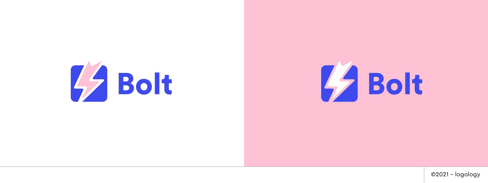
Proposal 3 – Resonance box
The circles evoke echoes. The lighting bolt in the middle of both square and circles signify centralizing feedbacks. The echoes are a moving feature: they can go back and forth.
7. Recap
I had a great time working on this logo case and I hope you enjoyed it too! Next week, I'll enhance another logo. Stay tuned!