Written on March 5th, 2021 by Lucie Baratte. In logo makeover.
Hello there, today I'll be reviewing and enhancing the brand design of list.app.
1. Foundation: The values behind list.app
list.app is an online tool to easily create and share lists on every topic you like. Their core values are to be simple, easy to use, and reliable. According to Logology’s questionnaire, list.app “is a playful startup with a classic voice. As a business, they are cheerful, lighthearted, and accessible. People perceive it as a standard, a recognized value.”
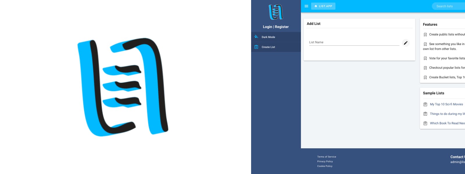
2. Good things about the current logo
- The hand-written style of the symbol gives a nice feeling of cheerfulness and spontaneity.
- The simplicity of the landing page design suggests that the tool is easy to use, efficient. You don’t need a lot of explanations or decorative patterns to understand the product. Everything seems well organized, you don’t fear being lost among all the lists and features.
3. Issues with the current logo
The main issue here is that the logo doesn’t feel playful enough to convey the values of sharing and accessibility. It looks more reliable and serious than cheerful and welcoming.
The current logo also misses the words “list.app”, it could be useful to add the name of the startup to be more memorizable and identified.
4. Improvement solution
To enhance the logo, we’ll keep the feeling of an easy-to-use, simple and efficient tool by clarifying the design, but we’ll also need to add fun and cheerfulness.
5. Design ideas
I’ve made a lot of sketches to bring playfulness to list.app in an organized way.
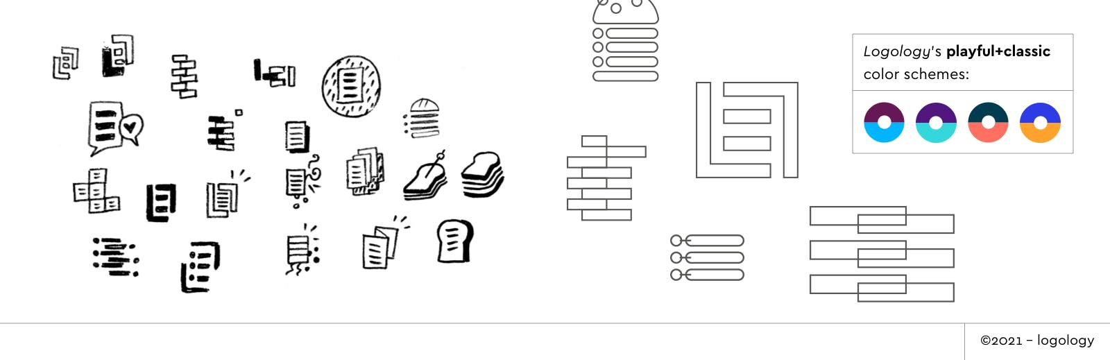
Symbol
- Try to combine L and A in a list shape to create an original monogram.
- Use blocks and shapes in a modular way to express playfulness and multiple combinations. Construction and re-built will evoke sharing and creativity.
- Try to use unexpected symbols like speech bubbles, data archives, “salad of ideas”, etc…
Colors
- Associate the freshness of the blue with a warm, dynamic and intense color (red, orange…).
- Bring originality by using purple or complementary colors instead of a calm range of blues.
(For this part, I chose playful color schemes from Logology’s catalog that could match the list.app style.)
Font
- Use a legible font with an original design: a typeface that would bring strength in a soft, welcome way or letters with a geometric design.
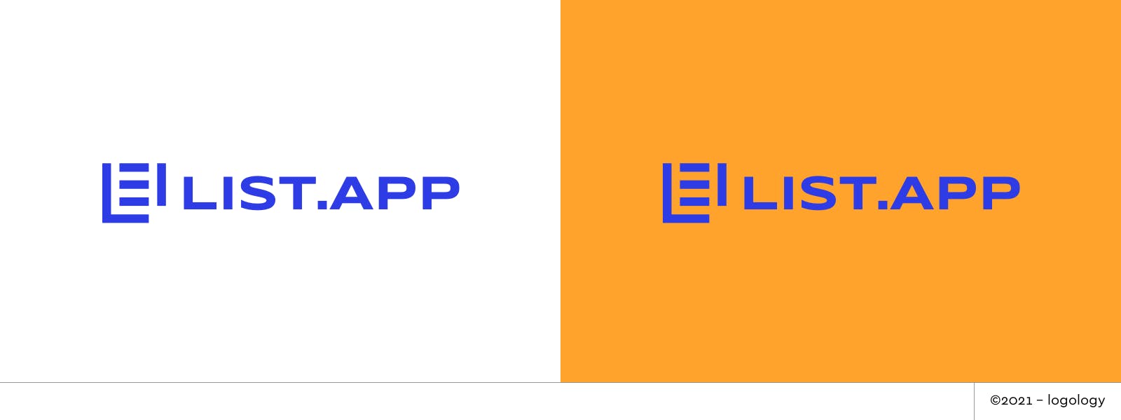
6. Logo Proposals
I applied all these ideas in the four proposals below.
Font: I picked Poppins SemiBold, Syncopate Bold, Righteous, and Montserrat Alternate ExtraBold according to the symbol.
Colors: I choose vivid, dynamic tones and schemes with a hint of blue.
Shapes: I used a minimalist design with geometric shapes and nice white spaces that could bring lightness and movement.
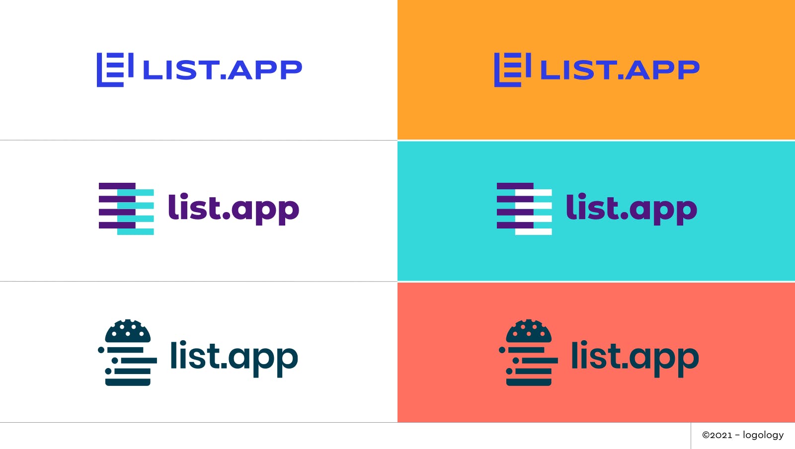
Proposal 1 – A place to store and create lists
In the spirit of the current logo, this proposal keeps the shape of the list but in an organized, efficient style. In one of the variants, the orange lines make us read the letters L and A of “list.app”. the geometric design gives a sense of construction in a fun way. And also, here, the design is clearer, the name of the startup is added and the legibility is enhanced.
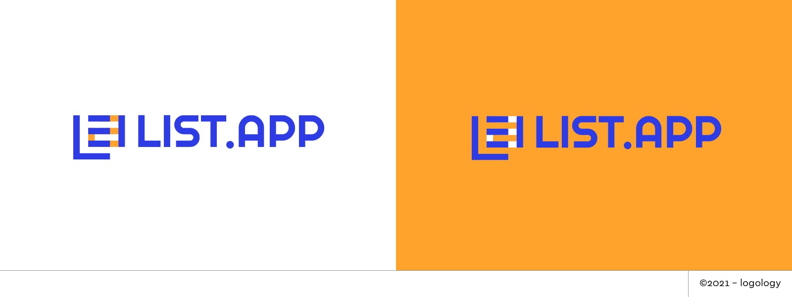
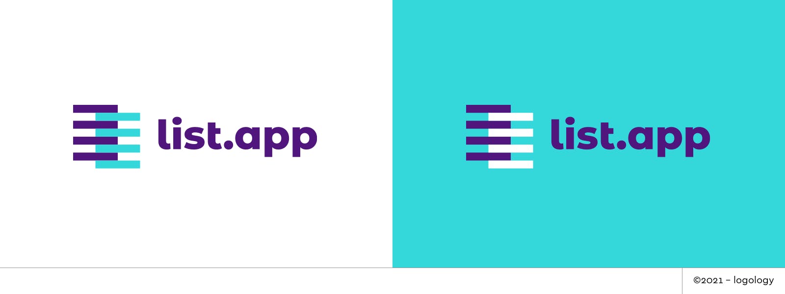
Proposal 2 – Playing with lists
The combination of the two lists symbolized by the horizontal lines gives the idea of sharing and combining data. The minimalism of the design evokes efficiency and simplicity
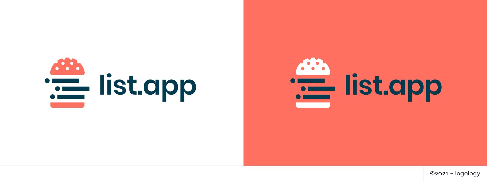
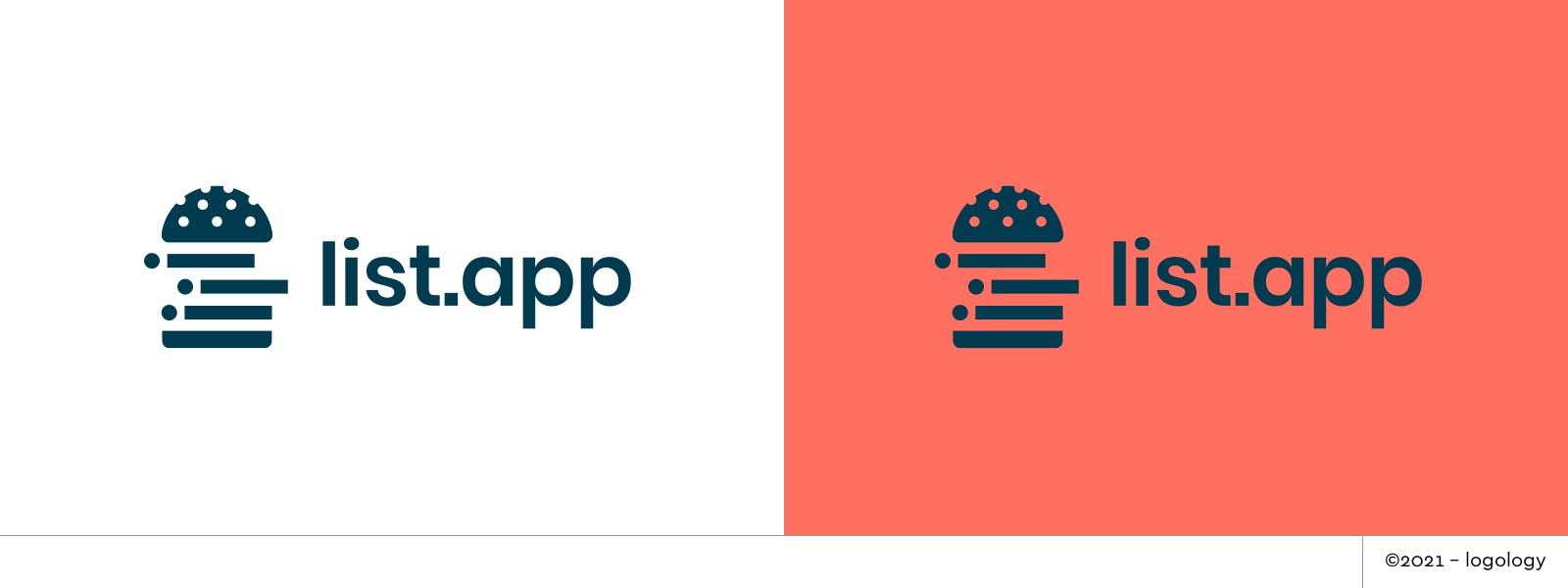
Proposal 3 – A combination of good ingredients
This logo proposal goes further in the playfulness. Creating lists is compared to the creation of sandwiches: you put your best ingredients in layers and share it with others to get inspired or to enjoy.
7. Recap
The list.app logo case was a fun one to work on. It was a completely different challenge than the 2 previous logo makeovers I did for Bolt and Handledroid but that’s what I enjoyed! Which proposal do you prefer?