Written on March 29th, 2021 by Lucie Baratte. In logo makeover.
Hello there, today I’ll be reviewing and enhancing the brand design of shokku. Let’s get started.
1. Foundation: The values behind shokku
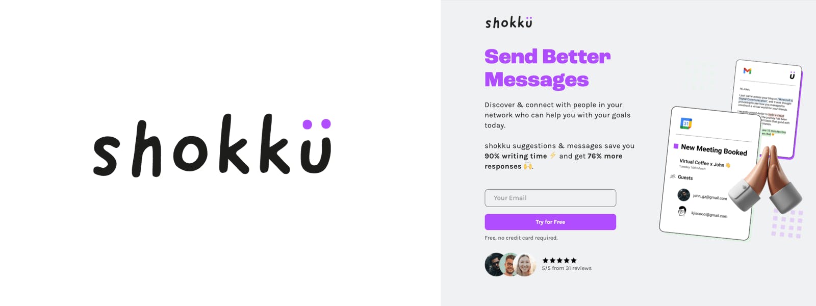
shokku is an app that helps you send meaningful outreach messages, whenever you want to get in touch with a colleague, a client, or a long-time no see friend.
The Japanese word “shokku” means “shock” in English, and it reveals the idea of sparking an impact on human relationships. Their core values are to express competence with a fun and playful edge.
According to Logology’s questionnaire, shokku “is a playful startup with an original voice. As a business, shokku is cheerful, lighthearted, and accessible. People perceive it as unique and trendy.”
2. Good things about the current logo
- The hand-written style of the letters gives a nice human feeling of friendliness, fun, and playfulness.
- The lowercase letters are a good choice to enhance the connotation of accessibility and simplicity.
- The idea of a smiling “u“ evokes welcome and cheerfulness. It’s interesting to use the symbol to express the benefit of the product rather than “how it works”.
- Purple is a relevant color to signify originality, boldness, magic. The neon vibe adds a modern edge that is perfect for digital projects.
- The simplicity of the landing page design and the current logo suggests that the tool is easy to use and accessible. Reaching someone appears to be easy, lighthearted, and simple.
3. Issue with the current logo
The main issue here is that the logo doesn’t feel solid enough to convey the value of ”competence”. It lacks a reassuring side.
4. Improvement solution
To enhance the logo, we’ll keep the spirit of a fun, original, and friendly tool with an efficient and simple demeanor, but we’ll also need to add a hint of stability and strength.
5. Design ideas
I’ve made a lot of sketches to bring strength to shokku in a playful way.
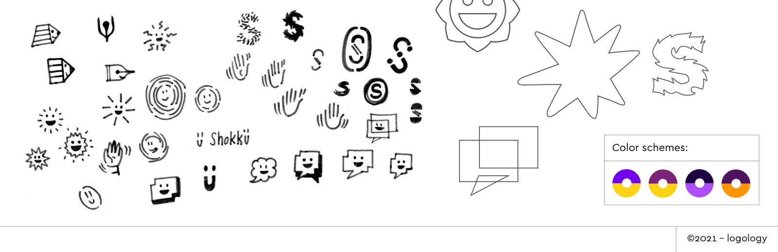
Symbol
- Try an original monogram to give authority to the brand and evoke a construction game.
- Apply the smiling face idea to different images: a spark, a seal, a vibration, a double-board, a window, a pen, etc…
- Try a hand saying “hello”.
Colors
- Associate the fresh boldness of the purple with its complementary color: a warm, dynamic and vibrant yellow (or orange).
Font
- Use a legible font with a playful edge: a typeface with a slanted axis or rounded edges.
- Use a geometric sans-serif font to evoke playfulness in a more calm and precise way.
(For this part, I chose a playful font selection from our catalog that could match the shokku style.
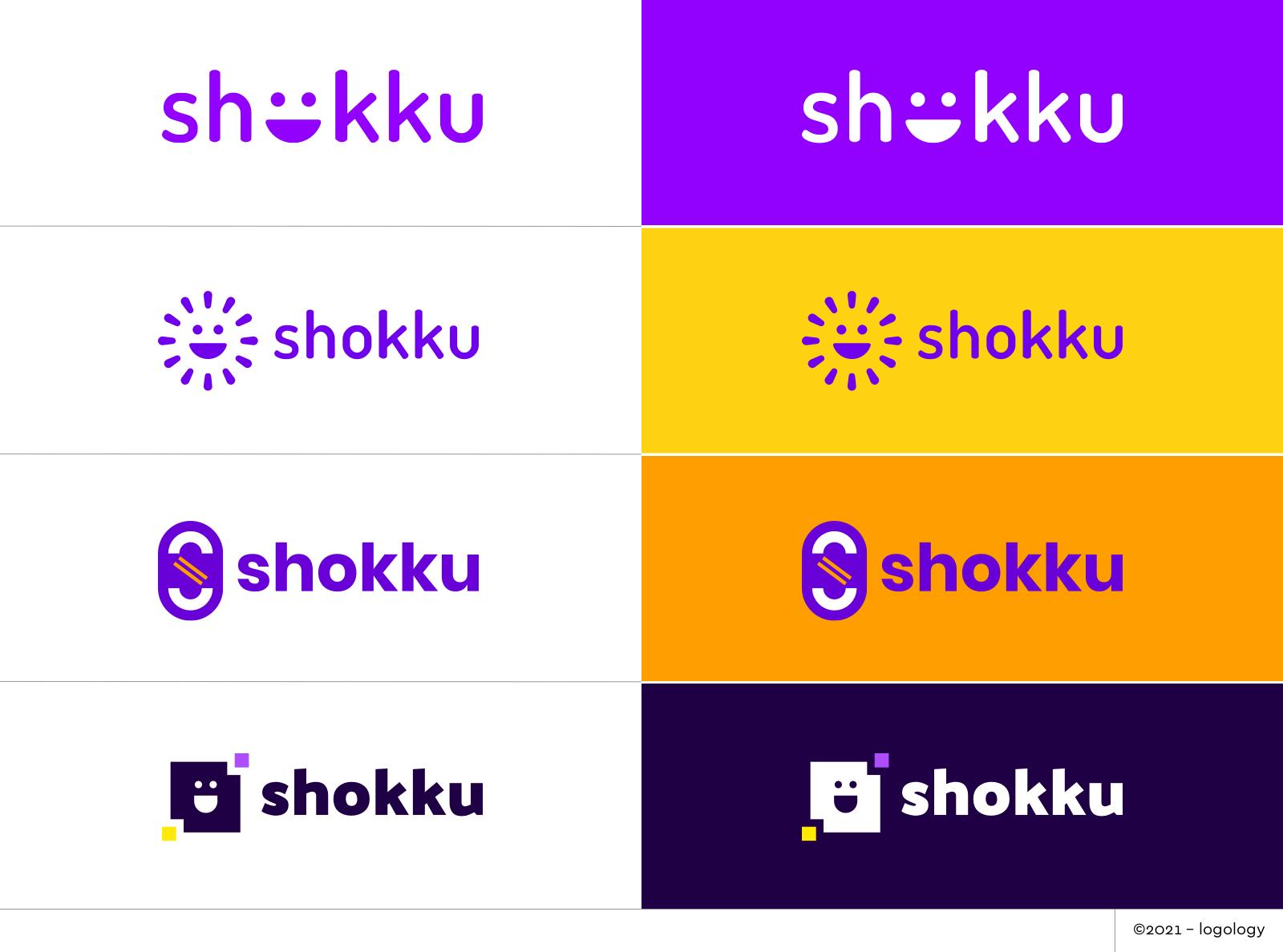
6. Logo Proposals
Font: I picked Dosis SemiBold, Dosis ExtraBold, Poppins Bold, and Palanquin Dark according to the symbol. I adjust the Dosis typefaces design, I shorten the ascenders to get a thicker logo.
Colors: I chose neon purple tones, like in the current logo, but I added warm and bright yellow and orange.
Shapes: I used round-edged shapes to keep the softness alive and geometric shapes to bring energy and simplicity. I played with the smiling face that I found was such a nice idea in the current logo.
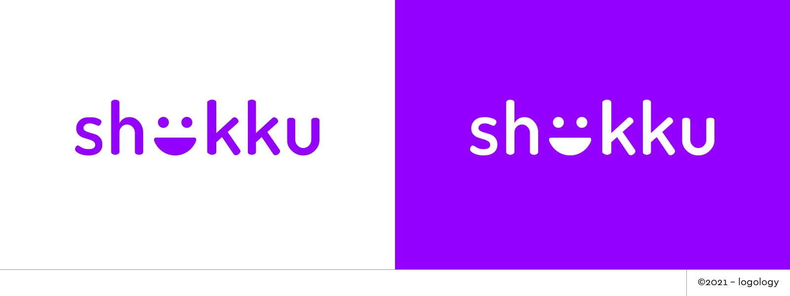
Proposal 1 – A friendly app
In the spirit of the current logo, this proposal keeps the smiling face popping up inside the word, it also keeps the round-edged design but uses a sans-serif font to bring stability. The smiling face in the center adds a sense of surprise and fun.
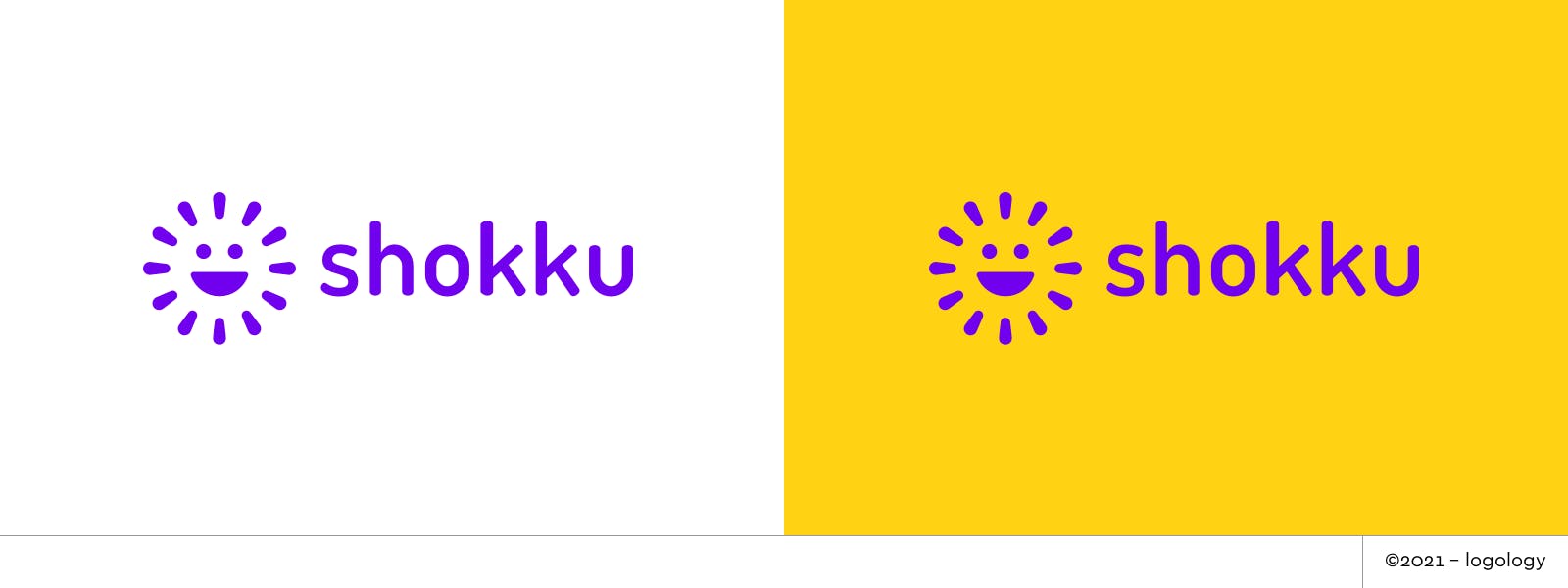
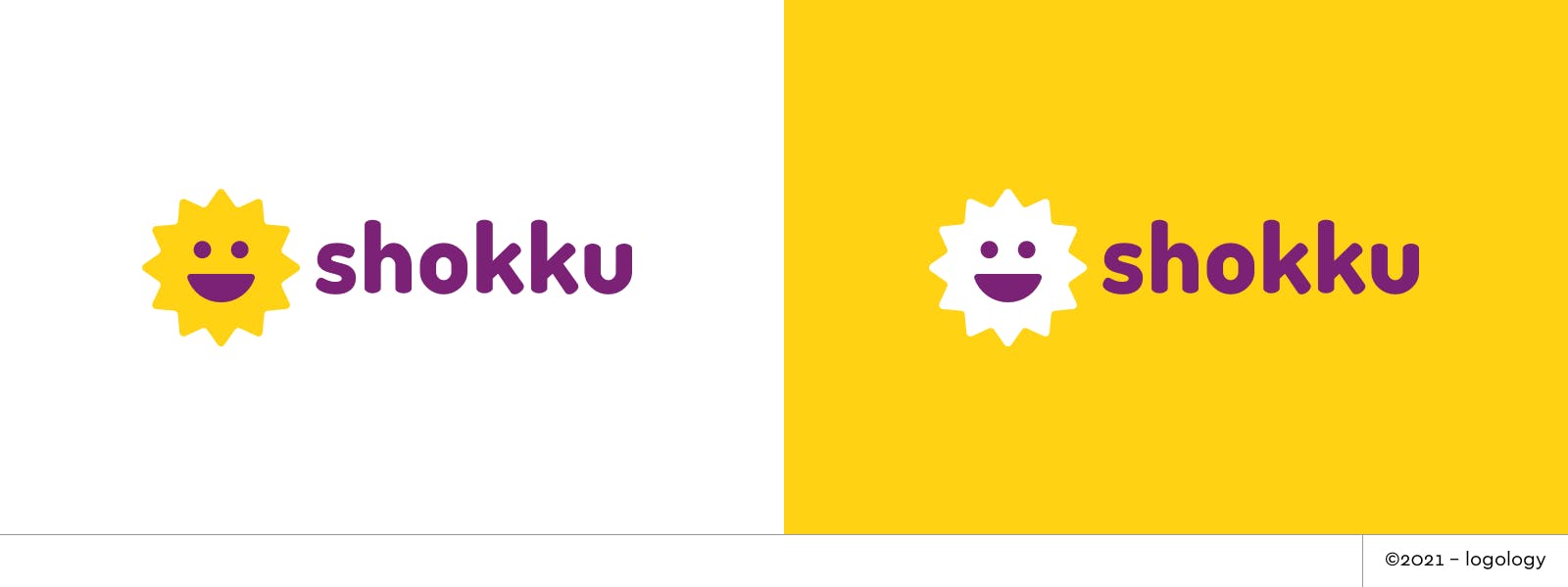
Proposal 2 – Sparking joy
This could be Marie Kondo’s favorite logo! More seriously, the smiling face personifies the joy of sparkle. The symbol evokes the action of the message: creating a nice human spark. The minimalism of the design evokes efficiency and simplicity. the rounded edges bring warmth.
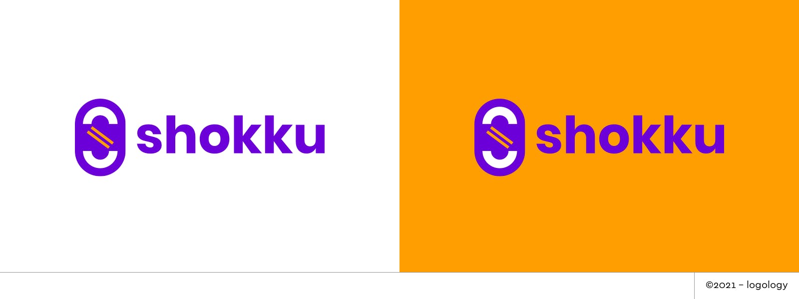
Proposal 3 – Getting two pieces together
The initial “S” gives a sense of authority. The pieces that compose the letters evoke a link between two entities.
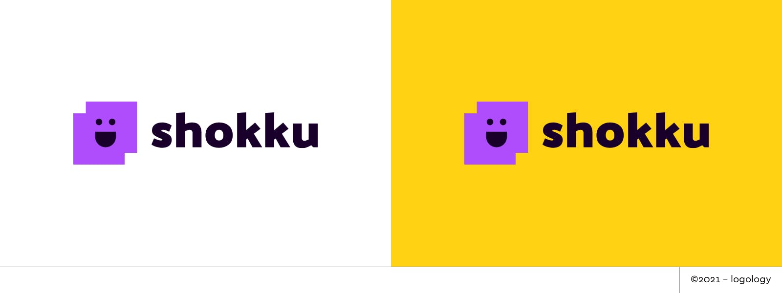
Proposal 4 – Smiling windows
This logo brings on the idea of two people connecting by merging two similar shapes. The smiling face in the center of the two-part window personifies the joy of the meeting.

7. Recap
This logo review was a difficult one because the current logo was already pretty nice and had a lot of good points. But I love design challenges and loved doing it! It was completely different from the ones I did before for Bolt, Handledroid or list.app.
Thank you for reading, see you soon!